25 Brilliant Video Landing Page Examples to Spark Your Inspiration
If a picture is worth a thousand words, can you imagine a similar adage to represent the effectiveness of a video in simplifying a concept or a message? Perhaps a video could be worth 100,000 words? No one can say for sure, and what really matters is how much they help us convey information to our customers, prospects, or users effectively and in a relatively short time.
Videos are used in countless ways on landing pages, with different goals depending on the context in which they are presented. Here are some examples:
- Product tour: These videos show a quick overview of how an app or product works, to give visitors a rough idea of what they can expect by signing up or purchasing the service. We really like these types of videos because if well executed, they can really make a difference in driving conversions.
- Promotional: These videos are more marketing-focused and typically consist of a mix of compelling messages, images, and previews of the actual product. We like this format because it can drive emotions and incentivise users to take action if well-directed.
- Walkthrough (features, functionalities, etc.): These videos offer a glimpse of how a specific feature works. They’re great for helping users understand more complex functionalities (e.g., a video of a financial app showing how easy it is to transfer money from one account to another).
In this article, we’ll show you 25 examples of landing pages that use videos as the central element on their home pages. You can take inspiration from how they’ve been implemented and structured to create your own video landing pages.
If you’re hungry for more landing pages displaying a video, we invite you to browse through our gallery of landing page inspiration, where you’ll find plenty of additional examples with high-quality design.
25 Brilliant Video Landing Page Examples
1. Equals
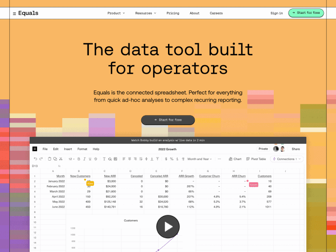
Equals shows a video on its landing page that provides an overview of how the product works, along with a walkthrough of its most important features. The video is well executed and is less than 3 minutes long, making it easy to watch even if you’re in a hurry.
Pro tip: If you’re thinking about implementing a similar video to your landing page, we suggest highlighting the best parts of your product so that you capture visitors’ attention immediately.
2. Reflect
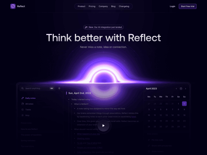
Reflect uses the video play button in the main screenshot of the app in the hero section, which is a smart idea. The video is a detailed walkthrough of the product, which lasts almost 15 minutes (probably too long for the average user).
Pro tip: We know that the quality of this page’s design will inspire many of you to do something similar. If you decide to do so, one suggestion is to make the button more in contrast with the background. Accessibility is key in every aspect of a landing page.
3. Wope
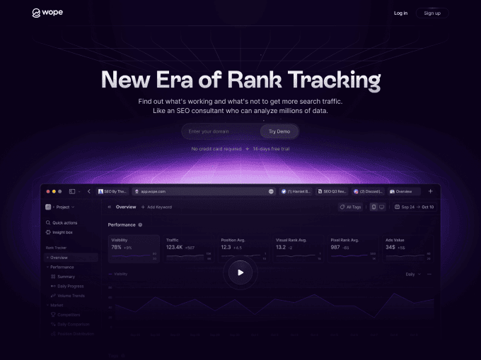
Similar to Reflect’s main screenshot, Wope displays a play button in the middle of its hero section. We like how the hover effect on this button tells you how long the video is before you play it.
Pro tip: As for Reflect, if you try something analogous make the button more visible and maybe increase the opacity of the screenshot in the background. In its current state, it is almost impossible to scan information.
4. Freehand
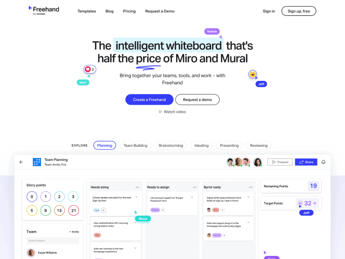
Freehand by InVision offers two ways to preview the app from its hero. Specifically, users can either click on a CTA below the headline (which opens a modal), or alternatively, see a dynamic screenshot of the product below the fold. In our opinion, they are both smartly executed.
Pro tip: Our only suggestion for this almost-perfect execution would be to make the recording slightly faster. With an increasingly frenetic user base and brutal competition, it would upset to lose visitors over such a trivial detail.
5. Overflow
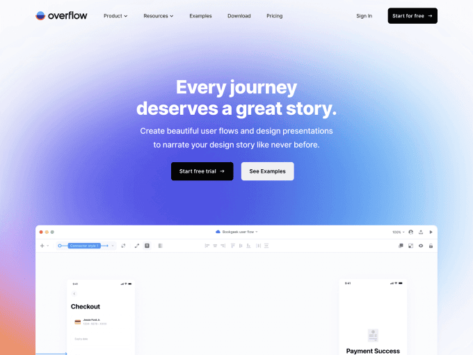
Very similar to what we saw with Freehand, Overflow shows a dynamic product screenshot in the middle of the hero and a secondary button to play it via a modal window. This landing page relies heavily on vibrant media to explain app characteristics and functionalities.
Pro tip: A detail we suggest you emulate in this landing page is the blurred shapes behind the product screenshot. Why? Simply because if it’s done well it brings extra attention to the main content and makes the content looks more premium.
6. Threads
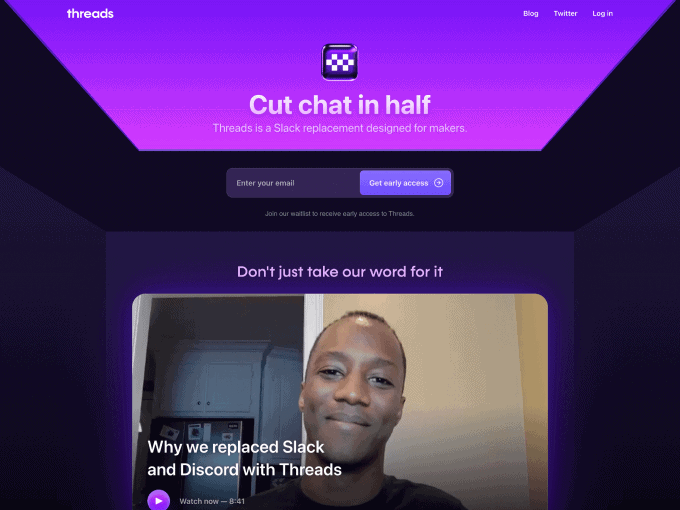
Threads is a great example of how a video can replace words and be used to explain what a product is in only a few seconds. We like that this video is both promotional and educational, providing plenty of information on how the app works.
Pro tip: If you have the opportunity, try to show dynamic previews of the video in the background. This will attract users’ attention and encourage them to click.
7. Play
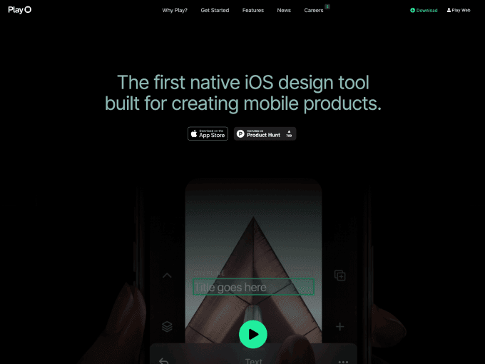
Play displays a button in the middle of the page. When clicked, this button expands the video to full-width mode. We enjoy the experience of watching the content without distraction, and we like how the combination of images and messages creates an engaging experience.
Pro tip: If you choose to incorporate the play button into the background like Play, be careful to manage your image backgrounds appropriately so that the action button is not obscured.
8. Wealthsimple Spend
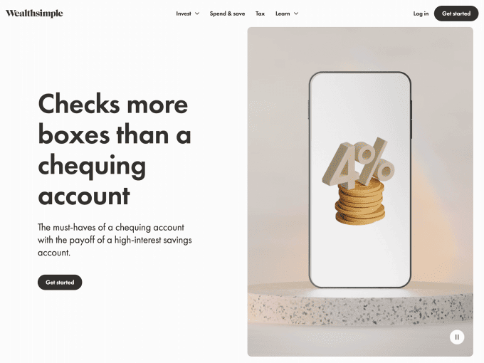
More than a full video, Wealthsimple Spend displays a quick video recording of the app on the right side of its hero section. It’s amazing how a clip of just a few sections captures the essence of the product and motivates visitors to download it.
Pro tip: We appreciate the execution of this video and suggest giving visitors the option to view it in full-screen mode as small details might be hard to see for people with visual problems.
9. Artboard Studio
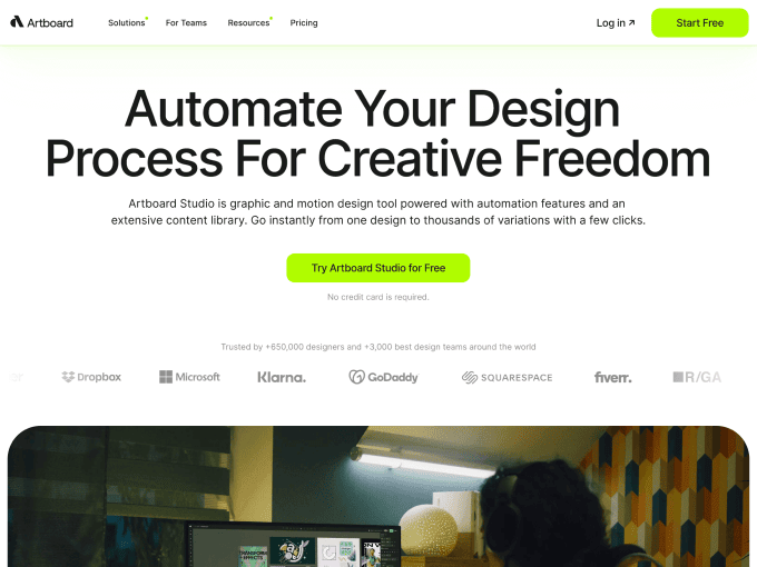
Artoboard Studio includes the video button above the main image in the centre of the hero section. Honestly, we don’t enjoy that the modal doesn’t display the video duration once opened, but we do like that the content is shown in full-width mode with an authentic voiceover.
Pro tip: When the text is in the background and the video button is highlighted, we suggest always checking for contrasts so that everything written is understandable.
10. Gusto Wallet
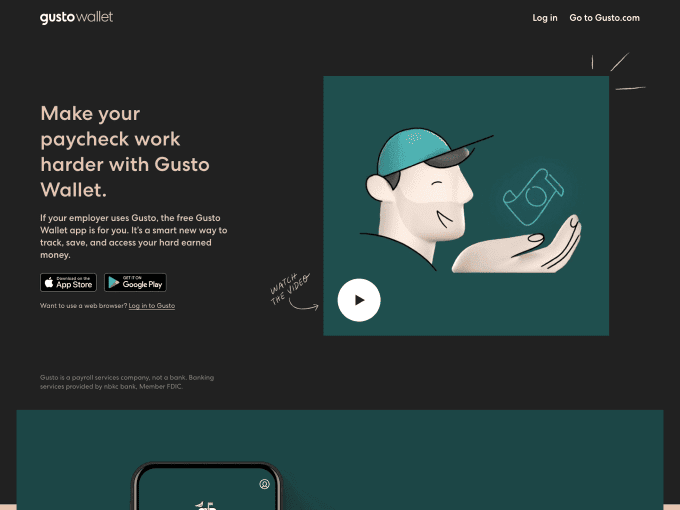
Gusto Wallet displays a prominent play button in the centre of its hero section, accompanied by a “watch the video” message that we honestly like. The only thing we don’t appreciate is that once users click the button, they’re taken away from the landing page to an external page.
Pro tip: If you like the idea of blurring the background image behind your video button, do so with care and never forget that anything we show must be easy to scan.
11. Cequence
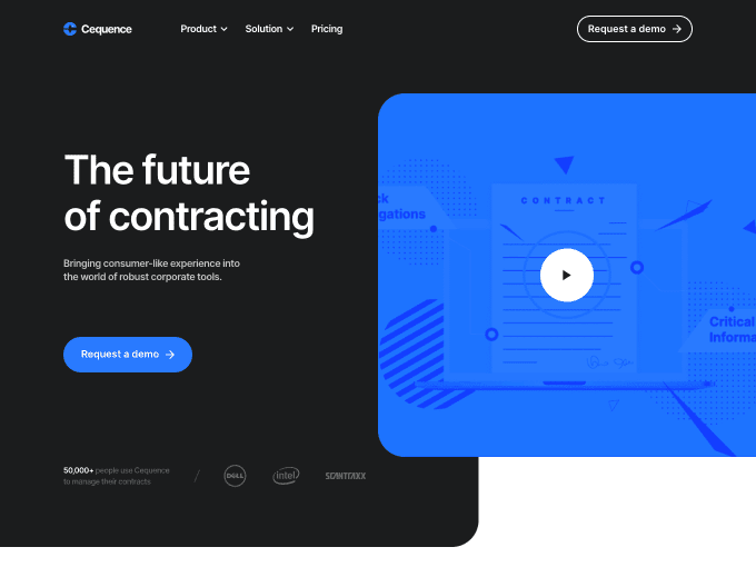
Cequence uses a large, square frame to display a video in the app’s main section. When you click the video, it opens full screen and plays a promotional recording about Cequence’s best features.
Pro tip: Using an image as a video preview can be a great idea because it encourages the user to take action and provides a clear idea of what they can expect before they commit.
12. Mosaic
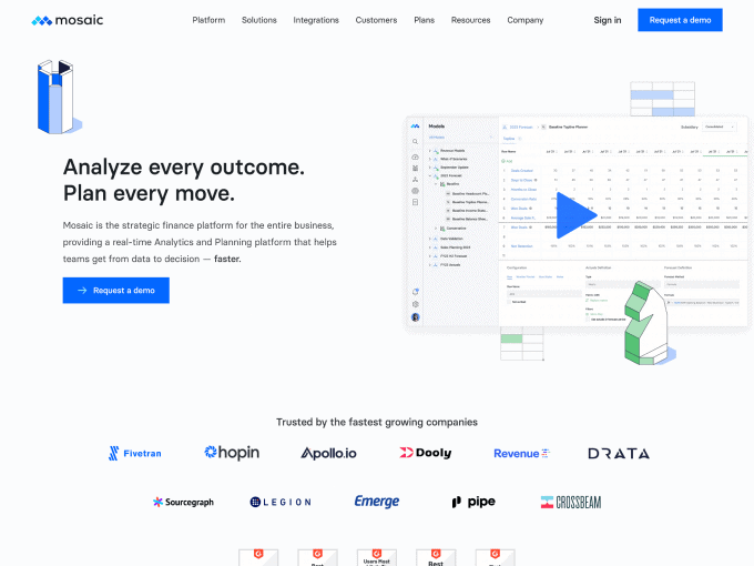
Like the other examples we examined in this list, Mosaic displays a big play button on top of the application screenshot. The content of the video is promotional and well-executed from start to finish.
Pro tip: You may have noticed that we’re fans of using product screenshots as backgrounds for our videos, but if you decide to use them, make sure they’re large enough to be visible to everyone, or else the result can be counterproductive (confusion instead of clarity).
13. Kepler
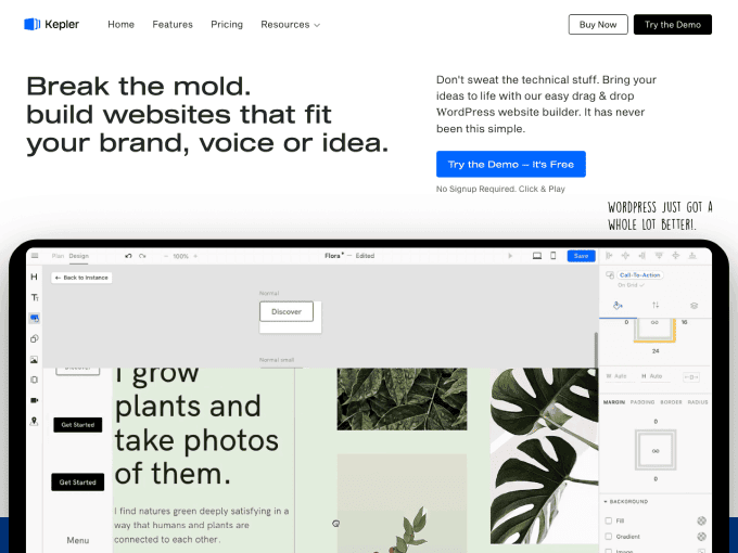
Kepler presents a traditional but effective way to show a video on its landing page. The screenshot of the app (along with a mockup of an iPad) and content autoplay without the user having to do anything.
Pro tip: We don’t mind this direction at all, but as in other cases examined in this article, when a video autoplay it’s always a good idea to give users the option to manage settings and frame advancement.
14. Bizzabo
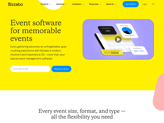
Bizzabo’s promotional video is a great example of how a recording made from scratch can influence the minds of the users visiting the landing page. The static mode displays a nice illustration in the background and once played, the combination of images and sounds makes watching the video something to remember for a long time.
Pro tip: If you decide not to show the video in full-width mode, at least give users the ability to adjust the video settings as Bizzabo does.
15. Twist
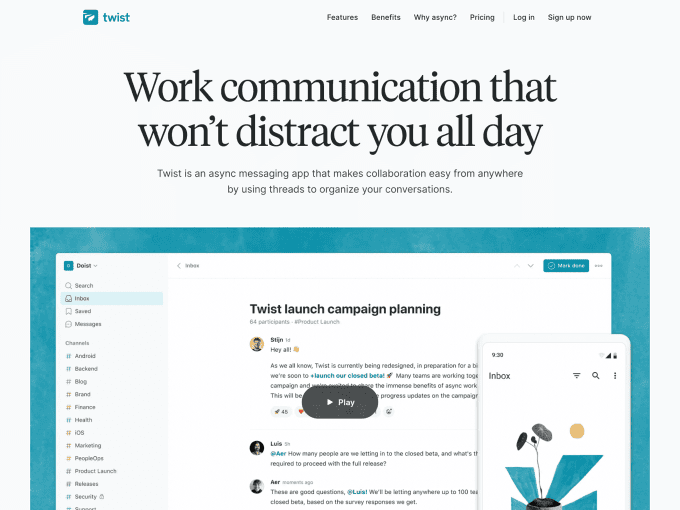
Twist is another example of how a well-placed video on a landing page can do an excellent job of capturing the attention of demanding users. The image of the app in the background provides important details of what the product offers, and by clicking the video button, you can get more information about its specific functionalities. We do like it!
Pro tip: If a high-resolution image can clarify things for your users, imagine how much clearer it would be if you included multiple product screenshots.
16. Ironclad
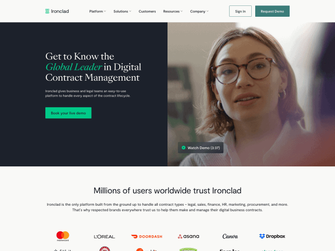
Ironclad uses a dynamic background in the hero section of its landing page to provide visitors with a preview of the content featured in the video. Once clicked, the video is shown in full mode and showcases various details about the app’s multiple functionalities. Some aspects we enjoyed about this example are the timestamps and information divided by customer segment.
Pro tip: If you decide to include a video that fills half of your landing page’s hero section, make sure not to overload the page with too much information, or the overall message might get lost. Do you remember Steve Jobs? Less is more.
17. 15five
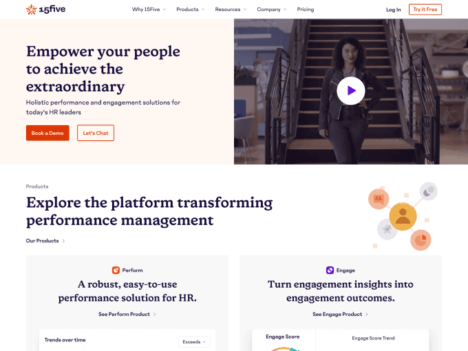
15five is a great example of how a video can add value to a landing page. We like that the video area occupies half of the hero section and that the fullscreen recorded content eliminates any distractions.
Pro tip: A background image for a video should always be exciting to the user. Before including it, ask yourself: Would I click on this button? The answer might surprise you.
18. Pupy
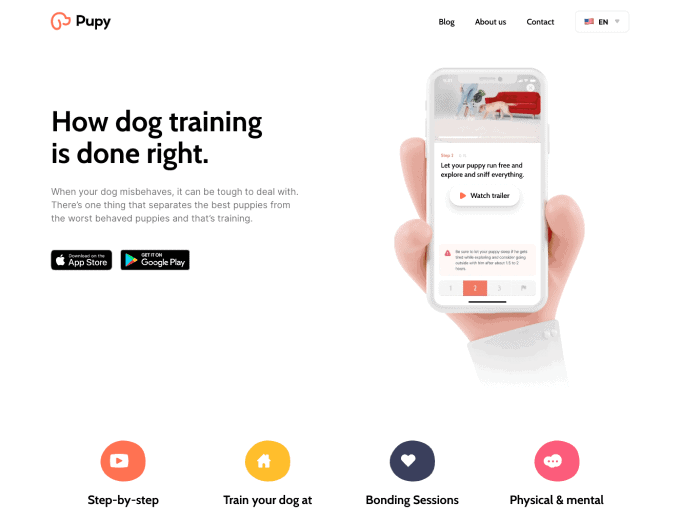
Pupy, as the name suggests, is a mobile application for dog owners who want to train their four-legged friends independently. The product video is displayed, as always, in the hero section of the landing page and consists of a static part (which plays out in the background) and a dynamic second part that is shown in fullscreen mode once the button is clicked.
Pro tip: If you use a decorative object to accompany your video (for example, an iPhone mockup), avoid including other elements like a hand holding the phone. The reason? They don’t add any value and dilute your message.
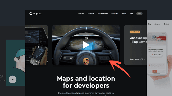
19. Mapbox
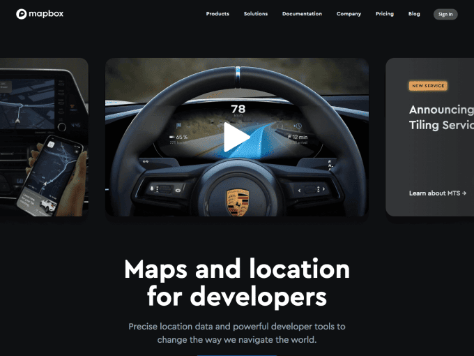
Mapbox displays a carousel of videos immediately below the headline in the hero section, and the content of each video is shown based on the product’s features. We like that the video loads independently in the background. However, we are less fond of the lack of information about the duration of the recording and the inability to go forward or backwards.
Pro tip: If you need to display multiple elements, limit the number of them (for example, no more than 3). This way the user doesn’t get lost in digesting all the information.
20. Retool
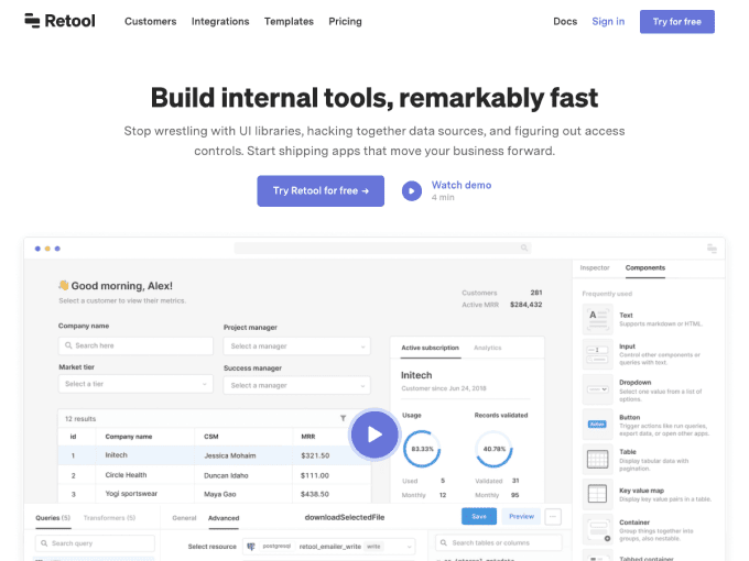
Retool showcases a full-page screenshot of its product with a centred button encouraging the user to launch the video. It is very clever to display information about the content even before clicking the button, and it is equally intelligent to have a recording that shows the image of the person filming it.
Pro tip: As suggested previously, a product screenshot provides the user with information about your app. However, if the content is unclear or contains too much information, this can be counterproductive.
21. Usersnap
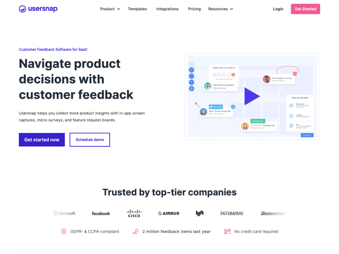
Unlike other examples we have examined in this list, Usersnap displays a simple/standalone ‘watch demo’ button on its landing page. Once clicked, it redirects to a page where you can schedule a demo with one of the company’s team members. We don’t particularly like this approach because it’s not an authentic video, but we wanted to show you this to provide you with an additional option in terms of inspiration.
Pro tip: If you want to convince your prospects to schedule a demo, make this information visible from the beginning or otherwise you risk creating false expectations and losing potential leads.
22. Slate
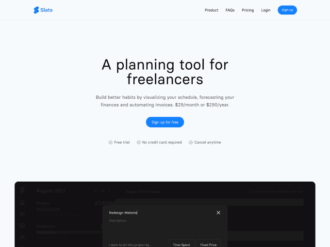
Slate displays a dynamic screenshot of its product at the centre of its landing page, showcasing various app features automatically. The idea of not having to click any buttons to view the content is interesting, although it’s a bit less appealing that there is no control over the information, nor the ability to pause the video.
Pro tip: When the content of a video auto-plays, you should include video settings so that users can control what they see.
23. Canny
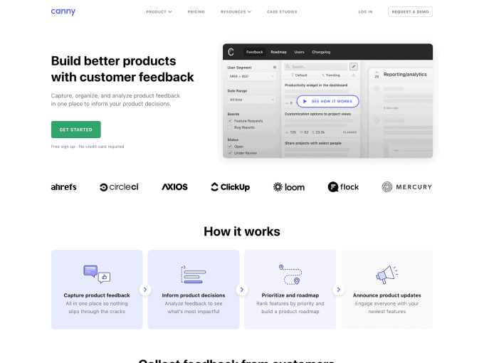
Canny explains in clear terms what content is in the video (“see how it works”), avoiding any false expectations before launching the recording. We agree with the choice of positioning the frame on the right side of the hero section, as well as the decision to discuss the product by starting with the problem it solves (an aspect often underestimated by many startups).
Pro tip: As Canny has done brilliantly, add a message about what the video will show so that you can prepare the viewer in advance for the content.
24. Klokki
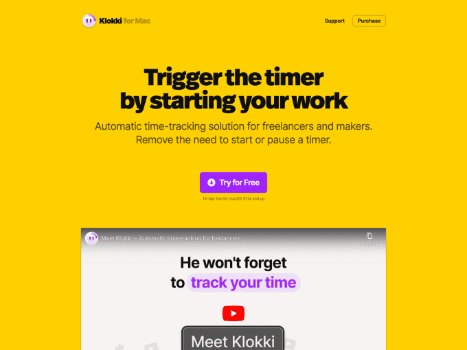
Klokki, a time-tracking application for Mac, uses a video at the centre of its landing page to showcase the various operations that can be performed using the app. The content of the video is expertly structured, making it engaging and easy to understand. The choice to make it short is considered an added value, especially for a product with a mission of optimising its customer’s time.
Pro tip: Even though the most important thing is the content you will show your users, it is always a good idea to present a video with an attractive design so that people will be motivated to take action.
25. Octopus
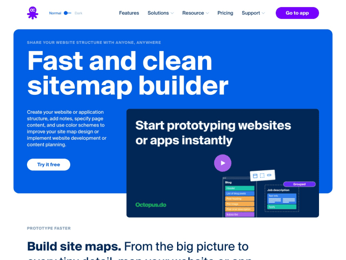
Octopus places its video in a low-key rectangle of the hero section of its landing page. The choice of not making the video central on the page is interesting because it encourages users to read the headline before anything else and to prepare them for what the product offers before going into details.
Pro tip: If you want to include text in a video frame, do so sparingly and be sure to use the same font as on your landing page for visual consistency.
Final thoughts
We’ve reached the end of this list of 25 examples of video landing pages, and we hope you found the content practical and inspiring for your use case. As a final comment, it’s never easy to say which example is the most effective for displaying a video on your landing page (that depends on your goals), but if we have to lean towards one choice, perhaps our favourite approach is to show a static product screenshot with a play video button on top. Why? Simply because it offers users two options: quickly previewing the product without taking any action or watching the video if they are interested in more information. However you decide to implement it, we’re sure that including a video on your landing pages will help improve conversions and simplify the customer experience.
Additional resources
Below are three excellent articles that provide additional information about the topic. We didn’t write them, but we think they’re great resources for anyone looking to learn more about including videos on landing pages. These articles also show further examples, so that you can gather even more ideas if our list didn’t provide everything you were looking for.
- A Guide to Video Landing Pages – A detailed and effective guide from Vidyard, which explains why it’s important to use a video on a landing page with tips on how to do it effectively without making common mistakes.
- 11 Best Practices to Boost Landing Page Conversions with Video – A list of the best practices for including a video on a landing page, made by the well-known Search Engine Journal. This article includes suggestions and images to help readers better understand the information presented.
- The Benefits of Using Video on Landing Pages – In this article, the popular website builder Unbounce discusses the undeniable benefits of showing a video on a landing page, with actionable suggestions for making any videos more effective.