Superb Changelog Examples for Design Inspiration
A changelog, also known as product updates or release notes, is a special type of page that presents information about a product in chronological order. In simpler terms, it’s a way to showcase all the significant changes and updates made to a product, keeping customers informed about new features or functionalities.
While not all products have a changelog, it plays a crucial role in informing customers about changes they might not have discovered otherwise. Based on our experience running a gallery of landing page design inspiration, we have noticed the effectiveness of having a changelog for your product.
If you haven’t implemented a changelog for your product yet, we aim to convince you by sharing a list of 15 superb changelog examples. These carefully selected pages vary in layout and information architecture, demonstrating the beauty and efficacy of high-quality designs.
Before we dive in, let’s highlight the three most important factors that make a good changelog:
- Visual Representation: Each update should be accompanied by a relevant image to provide a visual depiction of the change or enhancement.
- Release Date: It’s important to include the release date alongside each update to allow users to track when a feature or functionality was released.
- Detailed Explanation: Each update should include a descriptive paragraph to provide users with a comprehensive understanding of what has been modified or added.
Superb Changelog Examples for Design Inspiration
Family
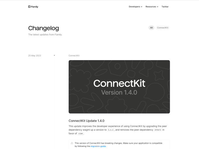
Family offers a traditional layout for its changelog that includes a vertical timeline with a date, image, title and description for each update. There’s really not much to comment on or criticise about this page because everything has been executed brilliantly.
Geckoboard
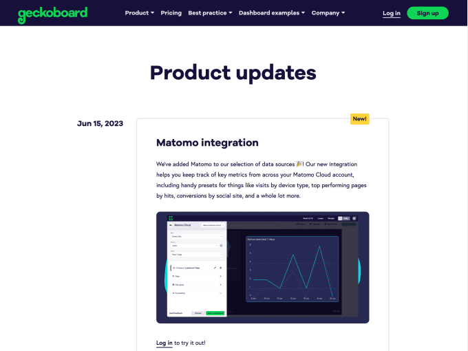
Geckoboard uses a vertical timeline for its changelog that doesn’t include a line connecting the updates but shows an image, title and description for each update. We like this execution, and if we were finicky we’d have appreciated an accompanying picture for each post (although we realise that isn’t easy to create).
Reflect
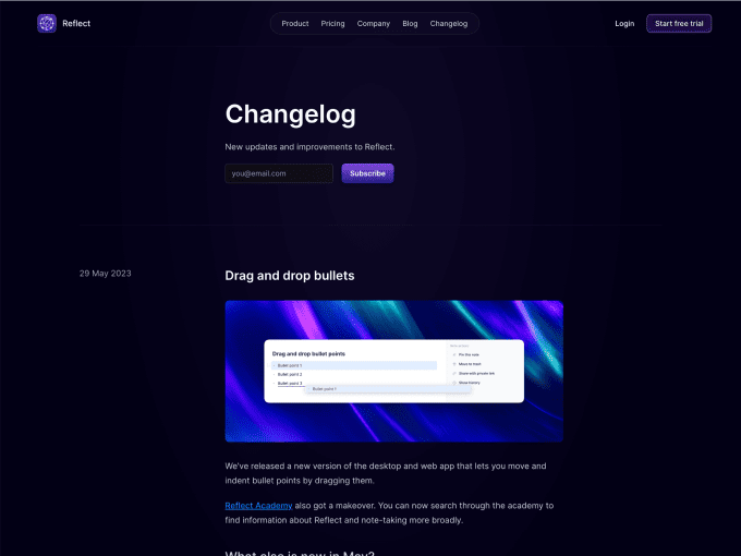
Reflect displays the changelog in chronological order. The choice is straightforward and effective, and we also appreciate the dark layout (which highlights information) and the product pictures that explain changes well.
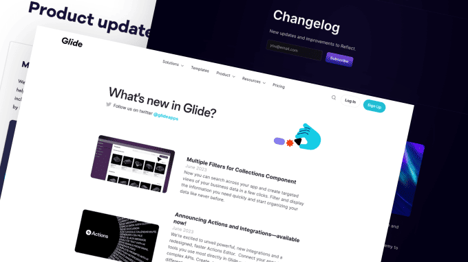
Glide
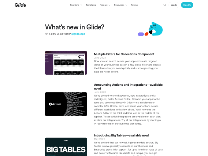
In the style of Glide, the changelog presents a simple layout that in some parts resembles the structure of a blog. We like the approach, but we’re not fans of how updates are displayed: the images are small, and it’s hard to see when they were added.
Relume Library
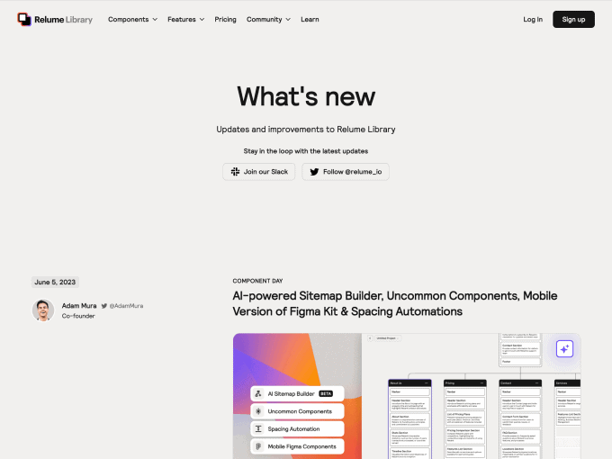
The changelog of Relume Library is a great example of how you can be creative even when the content doesn’t offer much room for imagination. We appreciate the quality of the pictures and that each update includes the name of the post owner, making it more personal, engaging and human!
Framer
Framer offers a slightly different layout for its changelog. On the left side of the timeline, you can find the update’s title and release date. On the right side, you have a picture and informative content about what has changed in the version. We like this structure because it’s easy to read and well-organised.
Cycle
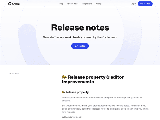
Even with cycles, the changelog presents traditional content, with the update’s date clearly highlighted and visual and textual information on the right side. We appreciate the presence of videos that alternate with images; however, we think that their quality could be improved.
Wise
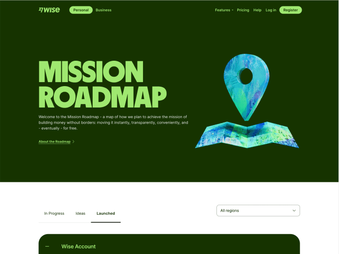
The Wise changelog features a very different format from the examples we’ve seen previously. Specifically, updates are displayed in card format–horizontally and vertically–in a table containing all posts.
Notion
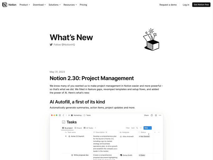
The changelog for Notion, as usual, is straightforward. It offers a well-organised flow of information (vertically), with each post including a title, description, and image/video of the update.
Sketch
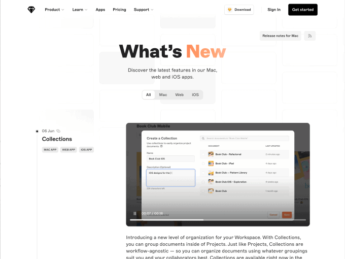
Sketch’s changelog shows top segment control to filter updates by platform type (e.g., iOS vs Mac). Scrolling down the page is a timeline of updates, where each post shows a title, description, tags, and the ability to generate a unique URL. This last option is very clever.
Junip
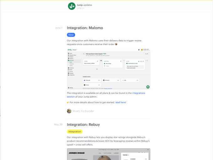
Junip probably uses a changelog creation platform, but we don’t care about that because we will judge the contents themselves. We like how the layout has been structured and that each update includes a category tag.
Attio
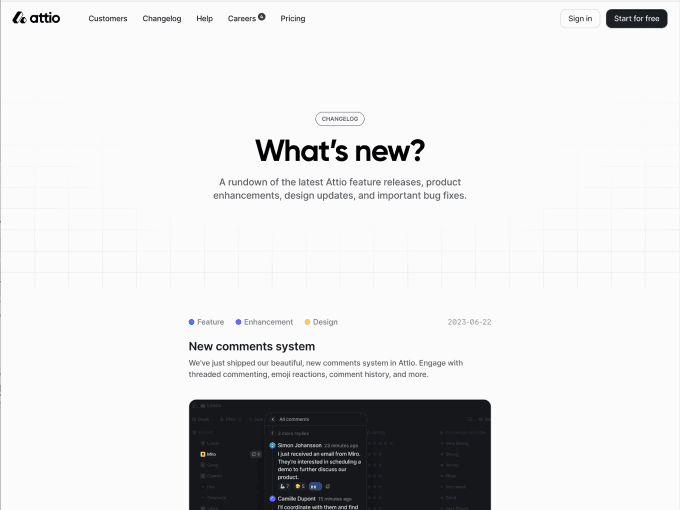
Attio’s changelog page is very well designed, and although the content is not rich, it is organised elegantly and intuitively. We appreciate that each post includes 1+ category tags and, much less that the page does not present pictures.
PlanetScale
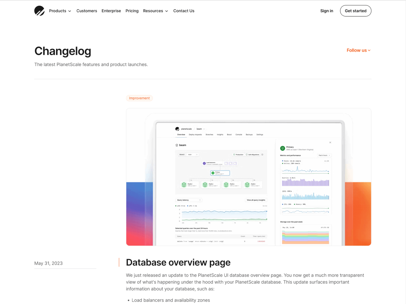
Although the page is organised classically, we found the changelog of PlanetScale a bit confusing and difficult to read. The picture that precedes the post title could be improved, as well as the information hierarchy.
Typefully
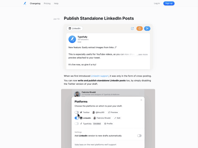
The Typefully changelog page contains images and videos for each post, and the texts are reduced to a minimum to favour visual focus. We think this direction is interesting, although there would be some work to perform on design details such as spacing, font sizes, etc.
Lemon Squeezy
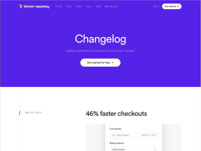
The Lemon Squeezy changelog embraces the timeline style (data on the left and image, title, and description on the right), and emphasises information by alternating the background colour of the posts. These small details make the interface always pleasant and memorable for the users.
—
We are confident that these examples have inspired you to create a changelog and keep your customers informed about updates and new features/functions to your app. While these examples are primarily from SaaS companies, we encourage you to adapt and apply these references to your own product, regardless of its nature, because they are universally valid.
Naturally, if your product is a SaaS, we invite you to explore for further inspiration in our gallery of SaaS landing pages, pricing page examples, about us page examples, and much more.