10+ Brilliant How it Works Page Examples
It’s also worth pointing out that a “How It Works” page can benefit any type of product, as it allows companies to “sell” the best qualities of their apps to multiple users and prospects .
In terms of the content, a well-designed “How It Works” page typically includes a list of top features, details on how to use the app or service, and a step-by-step process for signing up.
Finally, it should be clarified that this page can be called by different names, such as features, solutions, etc., but despite of these differences, the content and structure remain the same.
In this article, we will show you a curated list of the 10 best How It Works pages that stand out for their quality and content structure. We are confident that these examples will be extremely useful in helping you develop your own designs and increase overall conversions.
Let’s dive into the inspiring planet of How it Works pages.
1. Spendesk
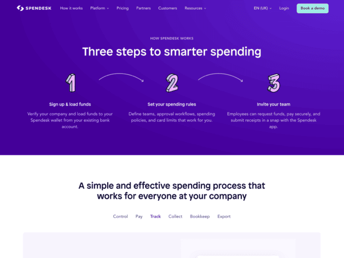
Spendesk’s How it Works page follows a clean and intuitive layout. It employs concise copy and visually appealing graphics to guide users through the steps of using their expense management platform.
Key features of this design:
- The page highlights key features and benefits of the application in a classic way, making it easy for potential customers to understand how Spendesk can streamline their financial processes.
- A 2-tone block colour dividing helps viewers perceive new information easier. There’s an additional block at the bottom of the page for those willing to learn even more about the app.
2. Betterlance
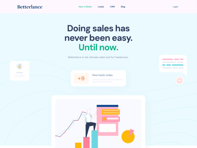
Betterlance presents a dynamic and minimalistic approach to the How it Works page for their freelance platform. Through creative storytelling and humble design, they showcase the journey of freelancers on their platform, from onboarding to successfully completing projects. This engaging approach helps build trust and establishes a connection with its target audience.
Key features of this design:
- Developers went with a simple and structured design to make sure every potential user understands the opportunities you get with Betterlance with ease.
- Light colours showcase a transparent and trustworthy approach to the company’s business processes.
3. #Paid
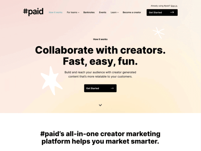
#Paid’s How it Works page stands out with its captivating visuals and a step-by-step breakdown of its influencer marketing platform. The page offers a comprehensive overview of how brands and influencers collaborate to create impactful campaigns. The presentation is a good example of impeccable text formatting.
Key features of this design:
- The main structure is realized with several lookalike blocks. Each block consists of a short paragraph and a relatable screenshot of the UI, which motivates users to try the platform.
- #Paid’s done a great job with text formatting. The perfect quantity of bullet lists and bold formatting stop users` attention on the most crucial aspects.
4. Rise
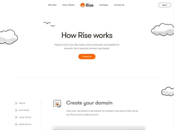
Rise adopts a simple yet elegant design for its How it Works page. The page doesn’t have long paragraphs. Instead, developers placed appealing animations to practically demonstrate the benefits of their financial platform. The progress bar plays an important role here as it gives a clear overview of the page structure.
Key features of this design:
- The page leads users through the process of getting started with Rise via practical short videos.
- A progress bar is a multifunctional element that gives a clear overview of the structure and showcases the simplicity of the setup process.
5. Talebook
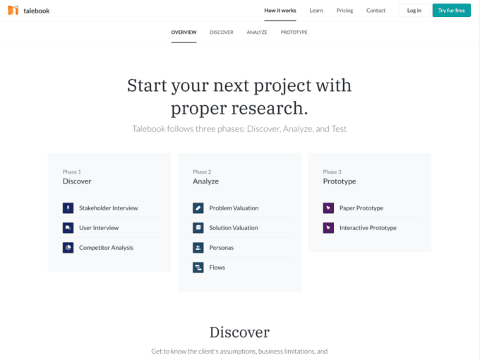
Talebook’s How it Works page structure is divided into a few so-called phases. They walk visitors through their storytelling platform and highlight only the most important information. It motivates users to learn more by clicking the link below.
Key features of this design:
- Users are introduced to a useful navigation menu to instantly jump to the part of the text they’re interested in.
- Bold colours and eye-catching visuals further enhance the page’s appeal.
6. Klarna
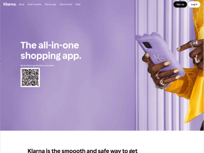
Klarna’s How it Works page showcases their “Smooth” shopping experience. Unlike our previous examples, Klarna creatively connects different blocks and sections, yet keeps explanations clear. It effectively brings the company’s values, therefore enticing customers to embrace a smoother shopping journey.
Key features of this design:
- The page highlights the availability of flexible payment options and a seamless checkout process.
- At the end of the page, one can instantly go to the category of the product they want to buy. It allows potential clients to start interacting with the platform right from the How it Works page.
7. Storetasker
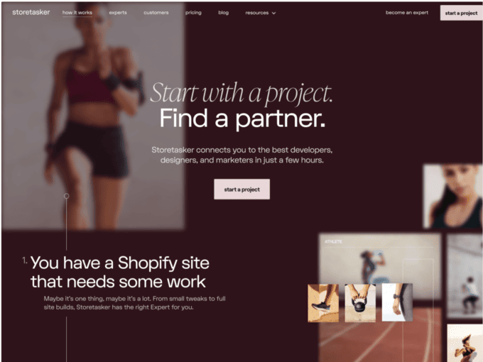
Storetasker’s How it Works page is well-structured and content-rich. They use a combination of minimalistic fonts, headings, and visuals to outline the process of finding and hiring Shopify experts. We’d also emphasize that real-life success stories and client reviews are built in an original way, having only the key steps mentioned.
Key features of this design:
- A straight line that starts from the header replaces progress bars and is nicely integrated into the paragraphs and buttons across the page.
- Developers diluted large blocks of text with emojis. This is a great way to add up to the engagement of users.
8. Path
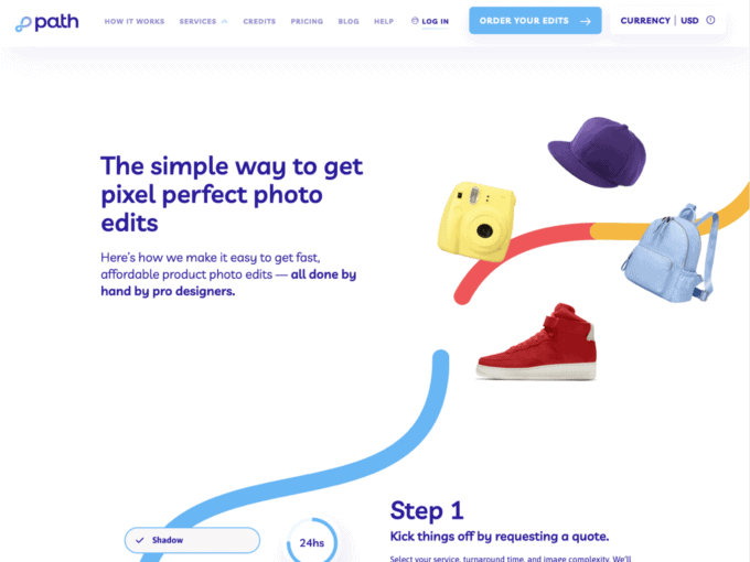
Path’s How it Works page is an excellent example of transparency and simplicity. With a focus on photo editing services, the page provides a clear breakdown of their process, pricing, and turnaround time. Before-and-after images are a must here as it showcases the quality of Path’s work.
Key features of this design:
- Similarly to the previous example, we have a curved line that serves as a progress bar. Bright and vibrant colours of the line improve overall engagement.
- A long list with reviews at the end of the page lets us scroll through the unique experiences of Path’s clients.
9. Maki
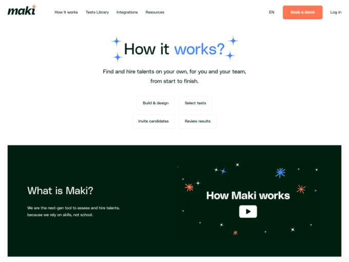
Maki’s How it Works section is seamlessly integrated into their features page. The company offers a comprehensive platform for building communities and social networks. Their informative graphics and concise descriptions illustrate how Maki empowers users to create engaging and customized online communities.
Key features of this design:
- The How it Works page is integrated into the features page and represents a layered approach to designing similar pages.
- Users always have an opportunity to jump to any topic and focus on the priority question.
10. Greenbridge
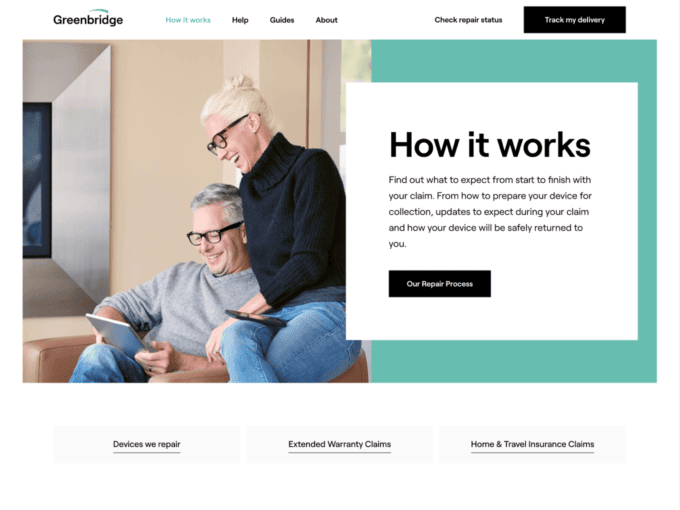
Greenbridge’s How it Works page follows a professional and visually pleasing format. The company offers eco-friendly solutions for businesses, and its page clearly presents the process of waste collection and recycling. Greenbridge effectively communicates its commitment to sustainability, appealing to environmentally-conscious customers.
Key features of this design:
- The team at Greenbridge knows its audience and its approach to the environment. The page has only the elements it brings good use of, such as visuals of waste recycling or courier collection.
- The fact that customers get to know everything about the company without clicking a single button is a sign of good structure organization.
11. Convo
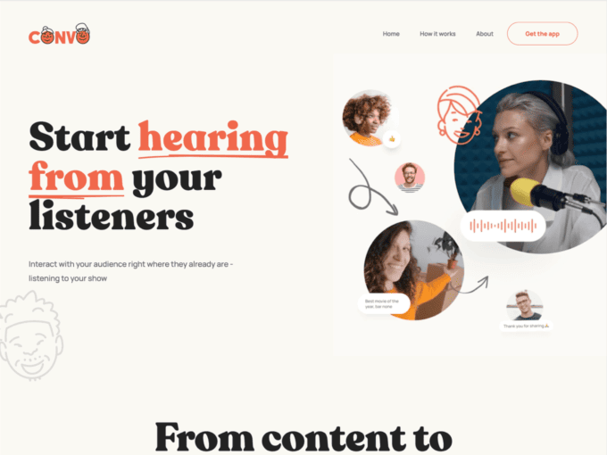
Convo’s How it Works page utilizes a video presentation to demonstrate its podcasting platform. The structure is built around text, yet effectively highlights the platform’s features, making it easy for potential users to visualize its benefits.
Key features of this design:
- Designers picked 2 main colours for texts and showed how effective that decision is. It’s a great way to capture users’ attention while avoiding using images or animation.
- A FAQ section at the bottom allows you to logically end the user’s journey.
12. Haven
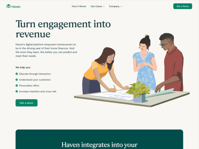
Haven’s How it Works page provides a comprehensive guide to their property management services. With a focus on hassle-free renting, the page presents a step-by-step explanation of the rental process, supported by real-life examples. Haven effectively addresses common pain points, attracting both landlords and tenants.
Key features of this design:
- Haven combines images and texts naturally, making a positive impact on users’ engagement.
- After reaching the bottom of the page, users can confidently choose the category they relate to the most to get more personalized information.
13. Cult
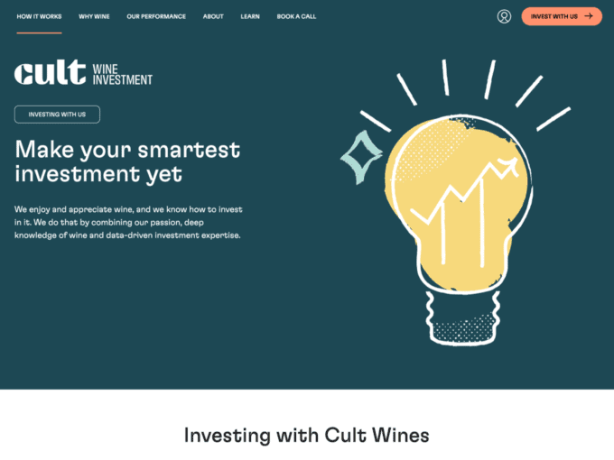
Cult’s How it Works page intricately navigates the world of wine investment, unravelling a strategic pathway. It guides enthusiasts from the art of selection to the culmination of liquidation. Users learn the key steps of wine investing through subtle visuals, keeping readers confident in their investing.
- Cult Wines brings its core values to users through 3 clear priorities that every wine enthusiast will like as well.
- At the bottom designers give you a sweet temptation. See the process of investing in wine effortlessly. Hard to say no!
—
These brilliant How it Works page examples exemplify the importance of effective communication and user-centric design. Each of these pages succeeds in providing clarity and transparency, making it easier for potential customers to understand and appreciate the value of the products and services they offer.
Creating or optimizing your own How it Works page requires creativity and, most importantly, an understanding of the final picture. We encourage you to draw inspiration from these examples and consider how you can tailor your content and design to cater to your target audience. A well-crafted How it Works page can be a powerful tool in converting visitors into satisfied customers. Many believe it’s the ultimate contribution to the success of your business or platform.
If your product is a SaaS, we invite you to explore for further inspiration in our gallery of the best SaaS landing pages, features page examples, and much more.