15 Best Comparison Page Examples and Why They Work
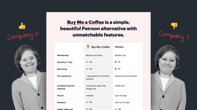
A comparison page, as the name suggests, is a website page designed to compare one product to another. It is generally used to showcase the differences between a service and its competition, and to highlight a product’s selling points against the competitor’s weaknesses.
As regular consumers browsing the web, we use comparison pages to help us make informed decisions when we’re unsure of which product to buy or if we’re looking for an alternative to a tool that no longer satisfies our needs.
It’s worth mentioning that comparison pages are also used as marketing funnels, so they may tend to overemphasise the quality of a service and weaken that of the competition. However, we can check the overall level of satisfaction with a product by reading reviews.
If you’re about to design a comparison page for your company, we put down some best practices that we think are important to keep in mind, along with a gallery of 15 examples from other companies that you can use as inspiration for your own design:
- Highlight your strengths and emphasise the competitor’s weaknesses. Showcase your advantages while highlighting areas where your competitor is weak.
- Focus on key features and user pain points. Users should browse your most important features that address the core challenges they face.
- Incorporate compelling calls to action. A persuasive call to action guides prospects towards taking your desired goal. Whether it’s signing up, exploring further, or making a purchase, this step is vital for conversion.
The best 15 comparison page examples:
Example 1 – Sketch
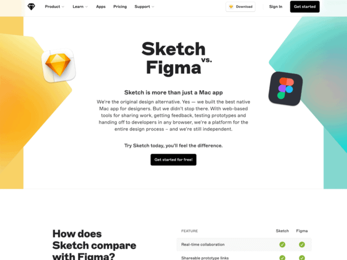
Sketch’s comparison page shows how it’s better than Figma. It focuses on stuff like real-time collaboration and design features. Using P3 colour profiles makes the page look good and easier to get around.
- The comparison page starts out with a nice, visual intro. It says Sketch is more than just an app for Mac. It was the original alternative to traditional design apps.
- User reviews say good things about Sketch’s intuitive interface, symbol controls, colour tokens and dark mode. Makes for a smooth experience.
Example 2 – Fathom
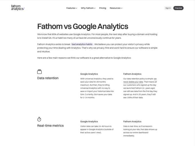
Fathom presents a clean and minimalistic comparison against Google Analytics. The key point here is the emphasis on privacy and intuitive metrics. Fathom’s page stands as an example of clarity and transparent communication.
- Sections are well organized, with each feature introduced through a simple header.
- The use of metrics, such as “Fathom Analytics is less than 2kb, while Google Analytics is almost 30kb,” helps users quickly feel the difference between the two products.
Example 3 – Ghost
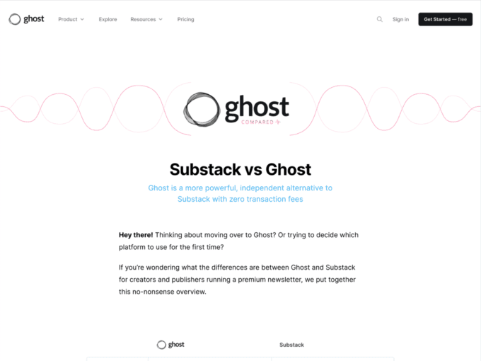
Ghost illustrates its product as a content management system and invites users to explore its features over Substack. The page presents a breakdown of how these platforms stack up against each other.
- Ghost chose a combination of generous white space with a clear font to ensure a comfortable reading experience. The structure is designed to guide users through each feature comparison step-by-step.
- The heart of the page are the table, and Ghost’s commitment to transparency. The column format allows users to quickly grasp the differences between Ghost and Subtask.
Example 4 – Podia
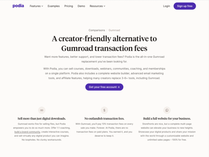
Podia stands out in its comparison with Gumroad by showcasing a different approach to sales. The comparison page focus on design and functionality, and motivate users to learn more about the diverse toolkit.
- Another important emphasis is the section about transaction fees. It showcases Podia’s capability to transform a storefront into a digital landscape.
- At the heart of the comparison page lies an immersive video demo, that gives a behind-the-scenes glimpse into the platform’s core functionalities.
Example 5 – Lemon Squeezy
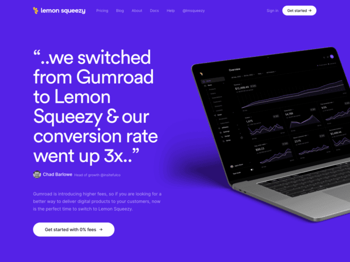
Lemon Squeezy’s comparison page is a testament to its digital commerce approach. It talks about fees, features, and flexibility, while the structure guides through its key functionalities.
- At the centre of the page lies a migration offer compelled specifically for switching from Gumroad. This resonates with creators seeking s relief from Gumroad’s higher fees.
- A key comparison takes place at the of the comparison page, centred around fees, where Lemon Squeezy showcases its competitive edge.
Example 6 – Grabee
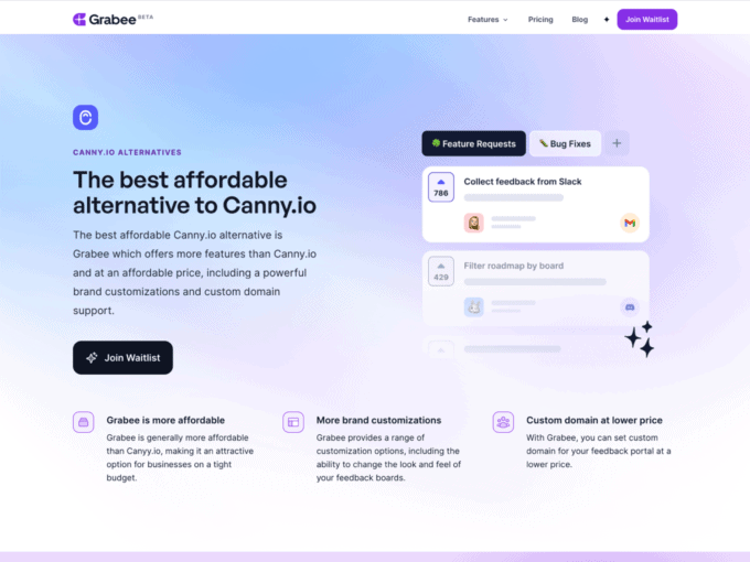
Grabee’s comparison with Canny.io shows prospects what these products offer in their respective plans, and what current and past users think about the these two companies.
- Grabee stands out as an alternative that not only matches but exceeds Canny.io’s features, all at a fraction of the cost.
- Grabee lets users customize the look and feel of their feedback boards to match their company’s brand and personality.
Example 7 – Slite
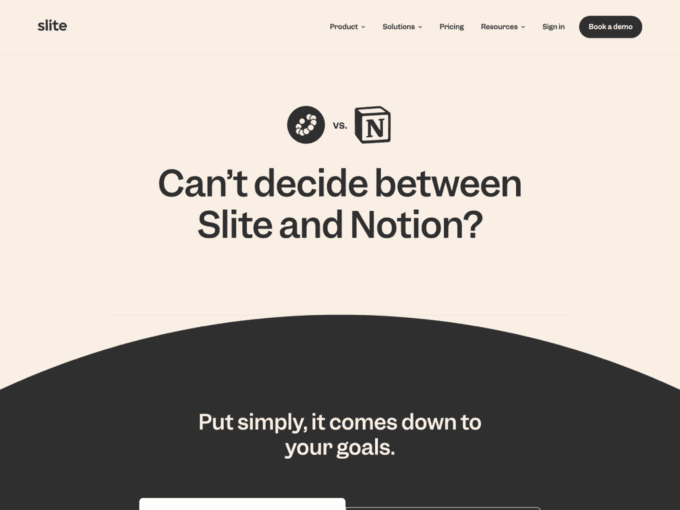
Slite’s comparison with Notion emphasizes its process in creating organized and collaborative documentation. The comparison page combines form and function, while breaking down each platform’s attributes, in their individual strengths.
- Slite’s minimalist interface becomes the canvas for focus. It’s a good example of how to incorporate sketches and videos on a page.
- Slite’s design is brilliant not only in structure, but also in empowering decision-making using the copy and calls to action.
Example 8 – Buy Me a Coffee
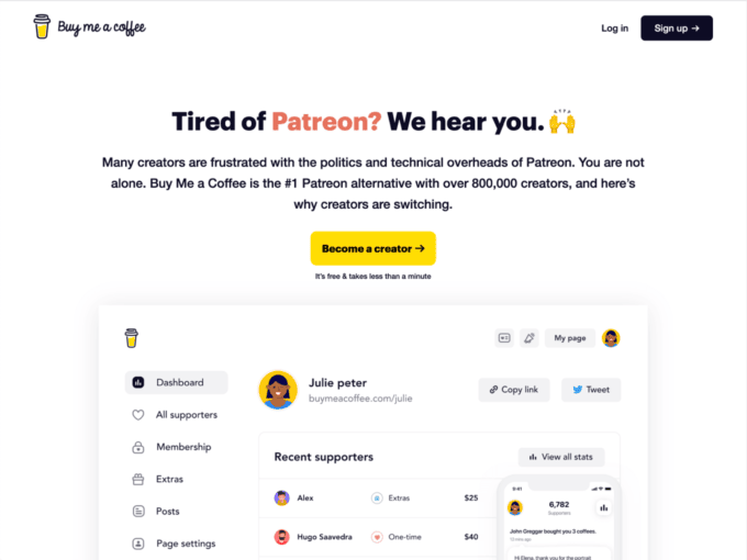
Buy Me a Coffee’s comparison page unveils the reasons why creators are making the switch from Patreon. The architecture of the page focus on benefits, and resonates with creators seeking an alternative to Patreon’s complexities.
- The storytelling approach takes centre stage, and amplifies the impact of each benefit. It’s a good way to enhance the advantages of Buy Me a Coffee offers over Patreon.
- The design integrates authentic testimonials from creators who have already made the transition. Testimonials serve as powerful validation and resonate with prospects on a personal level.
Example 9 – Stytch
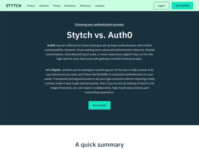
Stytch presents its unique aspects and guides users through Auth0’s weaknesses. The page begins with a clear and concise header that features the core differences between the two different approaches.
- All the benefits, such as authentication, or customization options, are described in a way users grasp immediately.
- The side-by-side comparison is presented in a tabular format. This layout enhances readability and allows users to quickly assess the features offered.
Example 10 – Teamway

Teamway demonstrates its capabilities as a marketplace leader by providing a comprehensive comparison page that helps visitors navigate the key differentiators that set the product apart from traditional centralised platforms.
- Teamway places the user at the forefront by addressing common pain points and concerns. The benefits of the Teamway are articulated in a way that directly speaks to the user’s needs.
- The page ends with a call-to-action (CTA) that invites users to take the next step and join the Tramway platform.
Example 11 – PandaDoc
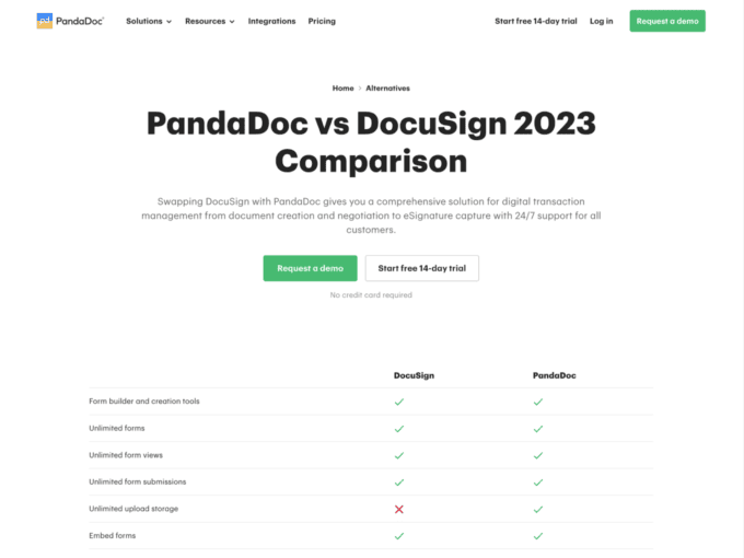
PandaDoc uncovers a clean design that facilitates the understanding of the platform’s offerings. The concise headline leaves no room for ambiguity and addresses the core purpose of the comparison.
- PandaDoc offers a solution for digital transaction management that supports companies at every stage, from the creation and negotiation of documents to the capture of signatures.
- The visual layout ensures that visitors can quickly identify the differentiators between DocuSign and PandaDoc. It also shows that PandaDoc has a deep understanding of user preferences.
Example 12 – Postmark
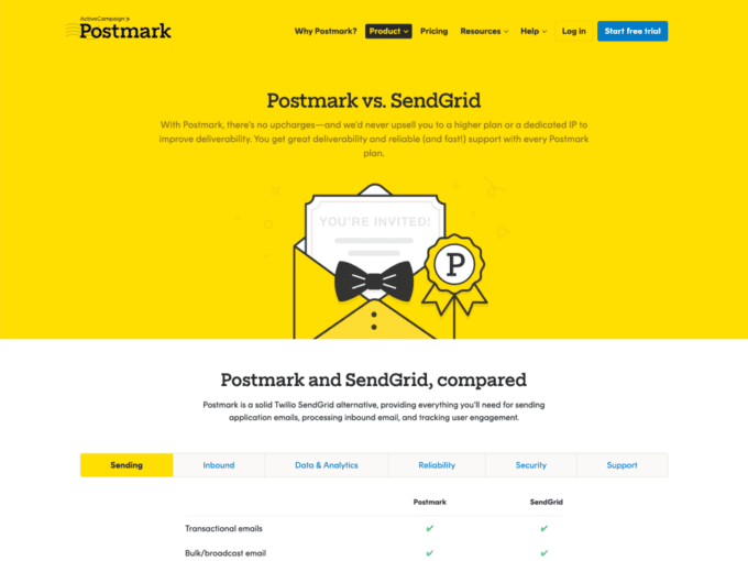
To set the tone, Postmark uses a rich comparison table that immediately captures users’ attention by presenting key differentiation points between itself, SendGrid, and Twilio.
- Postmark applies a visual checklist system, using icons and crosses, to convey the availability of features.
- The testimonials showcase the platform’s superior support and deliverability by highlighting successful transitions from SendGrid to Postmark.
Example 13 – Revealbot
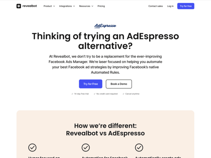
Revealbot’s comparison with AdEspresso highlights its powerful solutions for digital marketers. The page immediately clarifies Revealbot’s role as an automation tool to enhance Facebook ad strategies within the Meta ecosystem.
- Incorporating user reviews and ratings from trusted sources like G2 and Capterra increases Revealbot’s credibility.
- Revealbot outlines different pricing options for various spending levels. This makes it easier for users to give the product a try.
Example 14 – Pulsetic
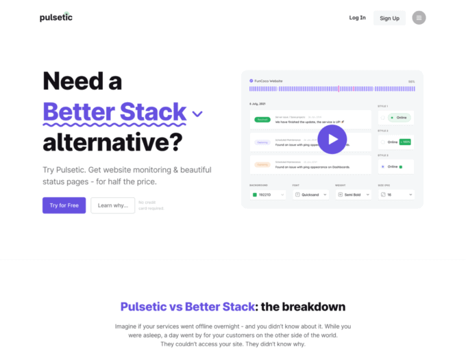
Pulsetic’s comparison page starts with a problem statement, prompting users to consider the need for reliable uptime monitoring and real-time updates. The company positions itself as a solution that ensures uptime monitoring and real-time updates, even in multiple languages.
- The page includes an innovative layout that analyses Pulsetic and Better Stack. Clear icons, and bold typography facilitate the comparison between the two platforms.
- A detailed pricing table showcases the value users can expect from Pulsetic’s plans in comparison to Better Stack.
Example 15 – Framer
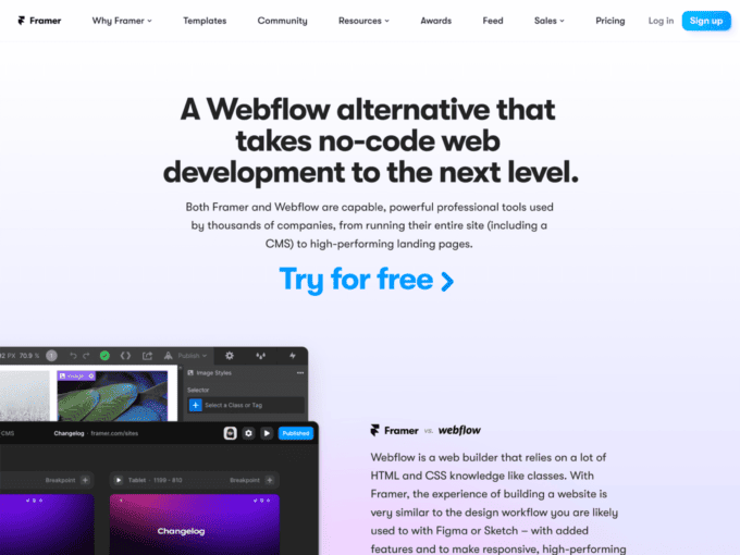
Framer’s comparison with Webflow is all about interactive design and digital experiences. The page starts with a catchy headline that introduces Framer as an AI-powered alternative for no-code web development .
- Several user testimonials outline why people are switching from Webflow to Framer. These testimonials add credibility and reveal the quality of the platform.
- Framer emphasizes its flexibility by explaining that users can add custom code or components for advanced integrations or dynamic sites.
Conclusion
The process of creating a well-designed comparison page lies somewhere between effective communication and user-centric design. Each of the pages included in this list showcases how you can differentiate yourself from the competition and win more loyal customers.
Are you looking for more inspiration for your SaaS website or landing page? Our extensive gallery of the best SaaS landing pages features a wealth of resources to fuel your ideas and imagination.