15 Outstanding FinTech & Finance Landing Pages
In this era of digital transformation, the landscape of financial services has changed dramatically. Banking, money transfers, and credit card services were primarily conducted in buildings, but not any longer. High-profile companies in the financial sector are now utilizing digital options, where the digital landscape is the primary arena for engaging customers.
This shift from old-school financial services towards online operations has not only presented opportunities but also created some problems for those in this sector. This is because the creation of engaging landing pages has now become important for FinTech and finance institutions. These landing pages are not just advertising pages, they are the digital face of an organization. If designed well, they will not only inform and engage the user but also convert the audience into customers.
At SaaS Landing Page, you will find that we address what makes an exceptional finance landing page and what elements should it employ so that it resonates with the target audience. To give you some examples to study, we’ve assembled a collection of the finest FinTech and Finance landing pages. These examples will not only help you in the creation of your finance landing page but also shed light on how the competition is effectively marketing its services in the digital age.
1. Wealthsimple
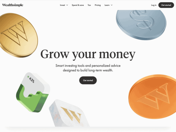
Wealthsimple has an easy-to-use yet attractive website. With high-quality graphics, the site uses modern widgets for customer accessibility.
On the very top of the page, there is a bar that has login options on the right-hand side and in the very middle, it has clickable options for users to redirect themselves to other parts of the page.
The site is divided into sections. The first one is the “Get Started” page, which allows new users to start their journey with Wealthsimple. The next section contains a widget for users that will take you to the part of the website that gives insides on managing your investments. These introductory sections are followed by one dedicated to Stocks and ETFs. With a click of a button, you will be led to an entire directory about trading and investing.
Scrolling down, the site includes a few credentials of the company, followed by a section dedicated to crypto and personal savings. This landing page ends with another to join the website and an option for users to subscribe to their site via email.
2. N26
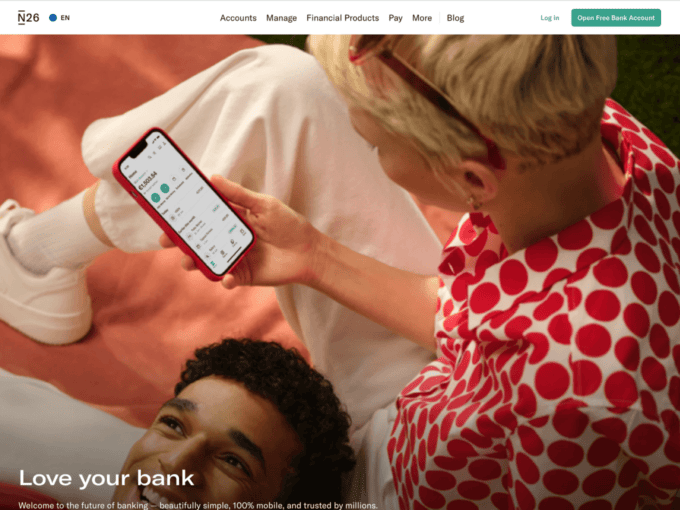
Like other fintech landing pages, N26’s page is also divided into sections. The top bar of the page contains options for visitors to direct themselves to other parts of the site.
The first section of the site contains a widget for you to open a free account in the bank, followed by more information about the account. The next section has clickable options for you to learn more about the security provided at the bank. Scrolling down from this are the sections on budgeting and crypto, which also includes
Scrolling to the near end of the page, you will find other features offered by the bank, including different spaces that customers can join as well as the option to use Apple Pay.
At the very end of the landing page, you can find statistics of N26’s customers and ratings, alongside a section for articles posted on the site.
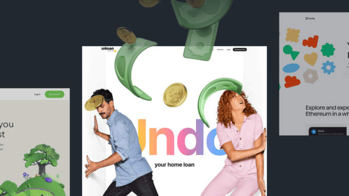
3. Unloan
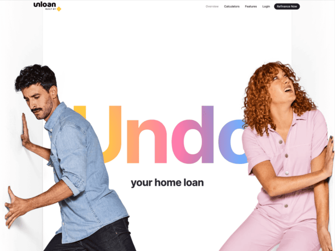
The landing page for Unloan is minimalistic and contemporary, with a great use of graphics from the bottom to the top. The bar in the top right of the page can be used to access resources present on the site.
The first part of the page includes advertising slogans and information about the company. Scrolling further from this, you can find clickable options that will give you more details about the features available. Moving down, there are more clickable options to redirect users towards other features offered by the company.
Towards the end of the page, there is a step-by-step guide to submitting your application, followed by a widget for asking questions. The last part includes the most frequently asked questions.
4. Family
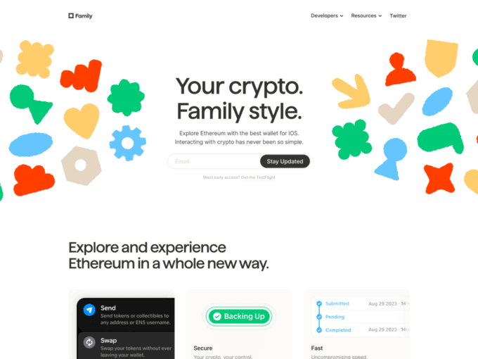
This landing page is easy on the eyes with colourful graphics that don’t consume the entire page. On the top right of the page, there are options to reach the resources and social media pages of the company, alongside information about the developers.
The first section of the page includes an option to subscribe to the site via email, followed by a graphical presentation of the features provided by the company. This takes up most of the middle section of the landing page, and even though these graphics are not clickable, they provide great details about the company and what it offers. There are texts attached to the pages and even video guides that can be viewed for more information.
Scrolling down, the site includes widgets that can be clicked to view the ConnectKit updates. In the last section of the landing page, you will find customer reviews and frequently asked questions.
5. Acorns
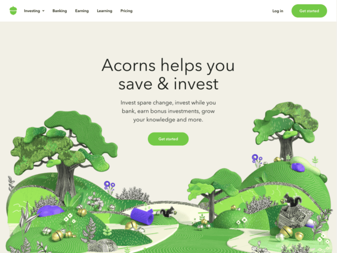
Acorns uses a colourful theme for its landing page, with mixed use of graphics and text. The start of the page includes a bar with sources that you can use to reach other parts of the site. Following this comes a widget for users to sign up for Acorns.
After scrolling right below this, you will find a calculator that you can use to quickly calculate the compound interest you need to earn profits. The next section of this landing page includes more information about the features offered by Acorns, followed by statistical information and reviews that support the company’s successes.
The last part of the page includes widgets for you to view details about the plans that you can sign up for and important disclosures that customers might want to know before signing up with the company.
6. Qonto
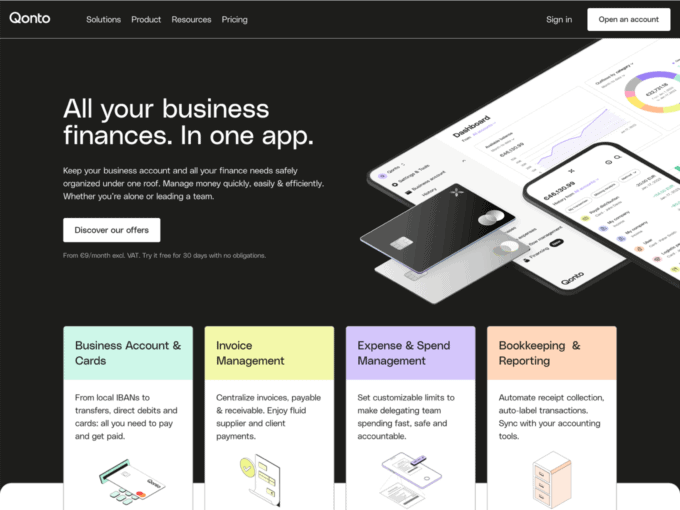
The landing page of Qonto has a black-and-white theme with splashes of colour in the middle. The page starts with resource options, followed by a widget on the main page that leads users to the different offers they can avail of.
Scrolling down, you will see four clickable options that give more detail about the features that the company offers. There are also some client-based options available on the page to make it easier for customers to figure out the options most suitable for them.
As you reach the middle of the landing page, you find a section dedicated to information about the cards that Qonto offers, along with the different services that customers can avail through the app.
At the very end of the page, there are options to discover the security and customer service facilities provided by Qonto. The last elements on the page are widgets that allow customers to open an account or book a demo.
7. Revolut
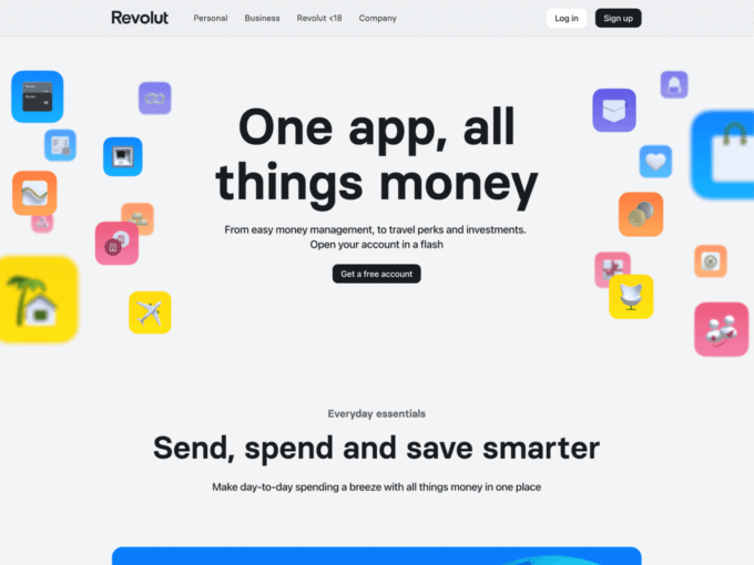
Revoult’s landing page has a marketing slogan posted at the very beginning of the page, written in bold. There is a range of widgets on the page that redirect visitors to other places on the site.
The first of these widgets allows customers to create a free account, and this is followed by one that allows them to explore the easy payment methods that the company offers. The next ones redirect visitors to the saving vaults and the discount options for maximizing their money. Scrolling further down, you will find more information about the card, as well as the features to manage your bank accounts and your subscriptions.
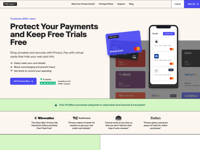
8. Privacy
The rest of the page is divided into multiple sections dedicated to different services. These include investments, lifestyle, travel, and security. The end of the page includes a section for news and a display of the different packages available.
Privacy’s landing page is divided into defined sections that display separate features offered by the company.
The first one is the membership section, which is followed by a separate section on controlling subscriptions. Following this, you will see privacy cards and tracking of transactions being explained in an easy-to-understand manner with a combination of graphics and text.
At the end of the page, the company has featured client reviews and frequently asked questions to provide the customers with more information.
9. Highnote
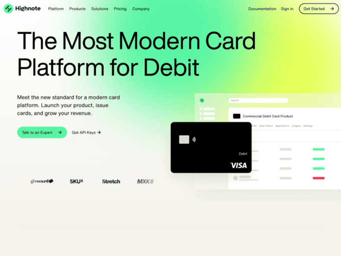
Highnote’s finance landing page uses interactive graphics to pull in the viewer. The tag line is at the very top of the page and uses clever variable slogans at the end to engage viewers from all sectors and industries.
Scrolling down, you can find the key takeaways of Highnote’s financial services which include a top-to-bottom service list for issuing cards. You can also customize your cards according to your needs, as displayed by some graphic widgets that lead the user to secondary pages within the same website for more information.
At the bottom of the page, Highnote’s finance landing page offers its audience a chance to look at the portfolio of the company, and some major companies that Highnote offers its services to.
10. Sammy
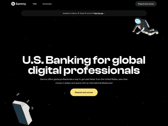
The landing page of ‘Sammy’s website opens with its major deliverable, which is getting paid from the U.S. while sitting anywhere else in the globe. The landing page brands its service as the future of the U.S. bank account. The whole layout is a set of interactive graphics and visuals as soon as you open the page.
Going down the page you can find all that Sammy offers which includes a list of why users should use this fintech service. These incentives include security, ease, and hassle-free payments.
Bottom of the page, you can find a secondary link widget that allows users to sign up for Sammy services and open their account online.
11. Wise
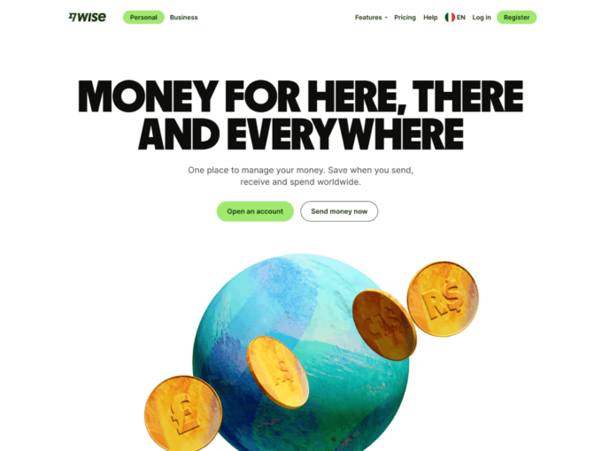
Wise’s landing page tries to set itself apart from all other finance services as soon as you lay eyes on its page. It claims to allow its users a 5x better chance to save money while moving money internationally.
Moving down the page, a colourful, green layout incorporates the rest of the incentives of using a Wise account. These include better security, faster payments, and easier cross-border transactions.
The last section of the page consists of a colourful array of flags, which are of member countries that use and allow for Wise services.
12. Vivid
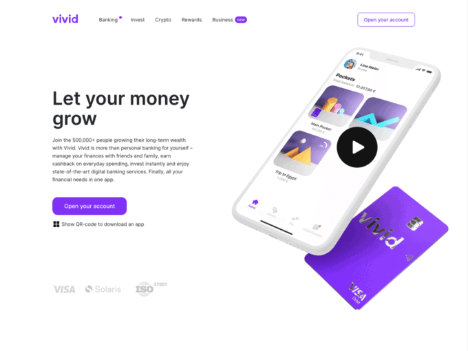
The landing page at Vivid opens with a detailed video on what it offers. As you shut down the video option, you get to see the tag line and its description that takes up most of your screen. The key takeaways of the service are included in this description which are fast investment turnover, personal accounts, and finance management.
In its page layout, Vivid tries to incorporate awards and accolades in between other elements such as investment and cashback options. The list of options is featured in widgets with external links to other pages on the website.
The last section of this page exclusively features the safety and security agenda of Vivid, with detailed measures and precautions that the clients will receive upon signing up.
13. Atlas
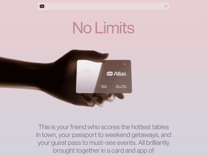
The page here at Atlas starts with a simple ‘No Limits’ tag line and a very minimalist graphic representation of a card. This pulls the audience in as they scroll down for further information.
Scrolling down, Atlas uses minimalism in its layout to introduce its audience to all the benefits that come with using its card. These include but are not limited to exclusive dining, reservations, tickets, and much more.
The page ends with a call to action widget that invites users to register with Atlas and become a founding member for just $999 per year.
14. Ness
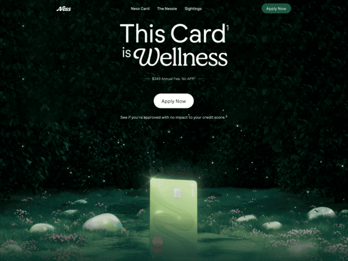
Featuring an engaging tag line and a call-to-action button, this landing page is interactive as soon as it starts. Moving down, Ness informs its users of its time-based offers and opportunities.
The middle of the page continues with offers and promotions based on value, benefits, limited discounts, and much more.
At the end of the page, Ness links its users to the Instagram handles of its famous users who employ Ness’s services in their respective work and businesses.
15. Slash
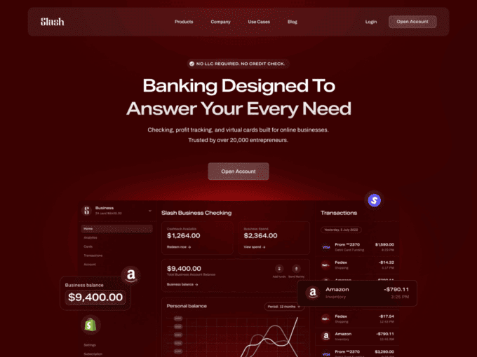
Slash’s landing page opens to a create your account option. Following that, as the user scrolls down, the interactive layout features incentives of using Slash.
These benefits include profit tracking and virtual cards. The graphics are coordinated to showcase Slash’s profitable trajectory by its benefits. The page also highlights its potential customers and what sort of businesses can benefit most from this sort of service.
The page ends with some Frequently Asked Questions that lead to other pages for more information.
Conclusion
We provided you with 15 Outstanding FinTech & Finance Landing Page Examples to form a guide for you. You can analyse these pages when working on your company site and take advantage of the range of features that these companies have utilized. These pages have proven to be beneficial, and it is evident that certain features can be seen being repeated in multiple sites, while others are unique for a certain company.
You can take inspiration from these pages and make a landing page for your company that would be subjective to your brand, but would also contain the technicalities required for the success of the page. Similarly, you can browse through our gallery of landing page inspiration for more ideas on how to establish a good website or even revamp an already existing one.