25 Examples of Beautiful Product Landing Pages
When it comes to product landing pages, the ultimate goal is clear: conversions. But what are the most important things that transform a visitor into a buyer? Let’s look at the key things successful product landing pages have in common and at tried-and-true best practices.
Before we move forward with the list, it is imperative that we address a few questions:
What is a Product Landing Page?
A product landing page is a space for presenting and promoting commodities or services to businesses and consumers. Unlike its counterpart, the traditional landing page, a product landing page caters to the distinct needs and preferences of various use cases. For example:
- Showcasing the benefits of a physical product
- Enhancing the features and functionalities of a digital service
- Defining the value proposition of a product against its competitors
Best Practices for Crafting a High-Performing Product Landing Page
The process of creating a product landing page resembles that of a traditional landing page, with a few exceptions. Here are the key principles and best practices:
- Clarify Your Objective: Whether your goal is to collect emails for a product launch or to register visitors for a free trial, you need to be clear about what you want to do. Defining your goal sets the tone for the entire message across the page.
- Design with Precision: As the product architect, it is imperative to sketch the layout before committing to the design. Consider the elements that resonate with your prospects; it can be a list of your feature set, robust social validation, or a call to action.
- Curate Purposeful Imagery: The imagery on your product landing page should be purpose-driven—a visual representation of your message. When strategically chosen, visuals amplify your narrative and guide visitors toward your desired destination.
- Mastery of Copy: The word is the most powerful tool of persuasion. Use it to instil trust and delineate your unique value proposition.
- Elegance in Simplicity: When creating your product landing page, try to avoid friction. This could include removing the need for credit cards when providing access to a free trial, or reducing the number of call to actions when they do not share the same goal.
Now that you know some of the best ways to create product pages, let’s look at 25 examples of beautiful product landing pages from leading companies online.
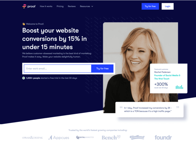
1. Proof
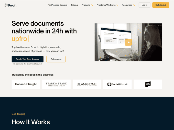
Proof is your go-to site for automating your work and digitalizing all your data. The landing page is structured in sections, with a colour palette that compliments it.
Different sections include features offered by the company, starting with a guide on how to use the site, followed by a mention of the various services Proof offers.
Throughout the page, different shades of colour light up the page, and highlights are used to further enhance its aesthetics. Graphics such as maps are used to give character to the elements being mentioned. Intractable widgets are also included to keep the user interested.
2. Gusto
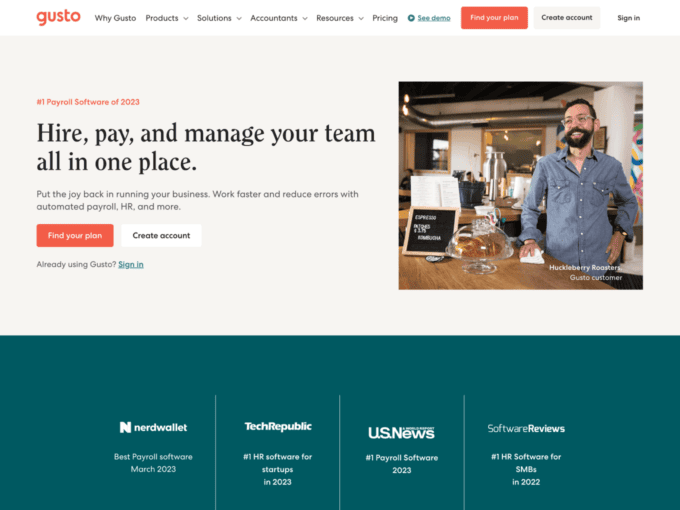
Gusto uses shades of orange and green to put its landing page together. This page includes sections to showcase the different services provided by the company. You will see customer reviews, guidelines to use the website, and supporting businesses, all present on the landing page.
Internal links have been added in parts of the site to direct users to other parts of the page. You will also find widgets with original graphics in different parts of the page that you can click for more information. Just not that, Gusto uses photographs of people throughout its page instead of just relying on graphical elements.
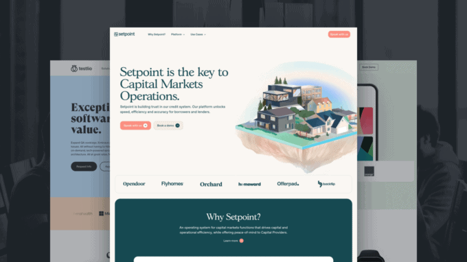
3. Setpoint
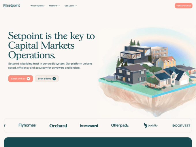
Like many other sites, Setpoint sticks to the minimalist, two to three-colour theme but adds unique graphics to brighten up the page.
At the very start of the page, you will see a picture of a house with effects of paint. Just like that, you will find similar graphics throughout the page with painting-like effects added to them.
Lastly, widgets have been used in a very distinct manner on this page, as they are interactive but many are also moving widgets.
4. Infermedica
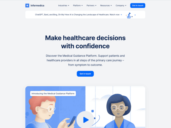
Infermedica is a healthcare service site that has followed a simple blue and white colour palette throughout the page.
Without overcrowding the page, they have showcased the mission of their company alongside the services they provide through videos, graphics, and widgets. Statistics and maps have also been used to further add character to the information provided. Customer reviews have also been added towards the end of the page with the images of the speakers.
For customer support, a Hub Bot is present on the bottom right of the page to answer queries. An email section is also provided at the end of the page if you want to connect with the team of experts.
5. Gigs
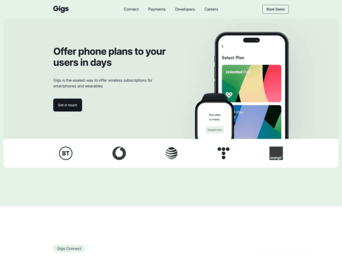
Gigs moves away from the traditional bright tones and uses a pastel colour palette instead of a dark font to highlight the given information.
Again, with smart use of graphics and widgets, Gigs has displayed the company’s features beautifully on this landing page. A unique point is the use of graphs alongside statistics to demonstrate the dashboard and analytics feature provided by the company.
Lastly, at the end of the page, you will find a list of clickable options that show the various job positions open at the company.
6. UseProof
Unlike other landing pages, Proof has a concise page that includes everything you need to know about the company.
The traditional blue and white tones are used throughout the page, with minimal use of widgets and graphics. Client reviews are the asset of this page as they are included throughout the layout. This is done in the form of videos, pictures as well and blogs in the end to showcase positive reviews.
At the bottom of the page, you are provided with an option to try out the free demo by signing up with your email.
7. Asana
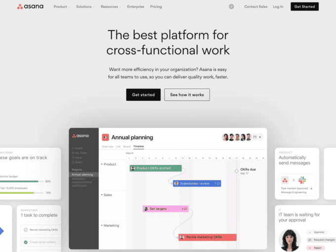
A black-and-white format with a calculated use of graphics makes Asana’s landing page attractive.
This is a short landing page with to-the-point information but gives a personal touch by welcoming you with your first name at the very top of the page. Following this, you will find a section dedicated to the features of the company, illustrated thanks to graphics and minimum information.
Right in the middle of the page, you will find a “What’s New in Asana” video to keep you updated with the latest development news.
8. HelpScout
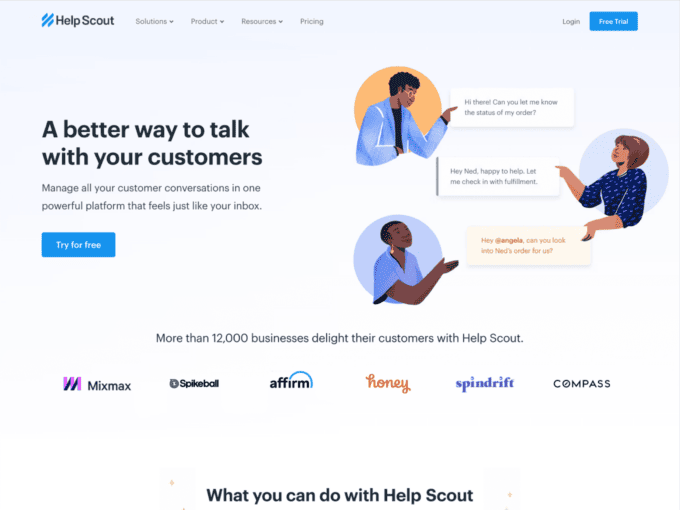
HelpScout uses a simplistic format and unique graphics to give its landing page a unique touch.
Pops of colours in the graphic catch the viewer’s eyes, along with moving widgets that further grab attention. The customer reviews have also been added in the same, moving format.
At the bottom right of the page, you will find an answering bot to provide immediate assistance.
9. Tranch
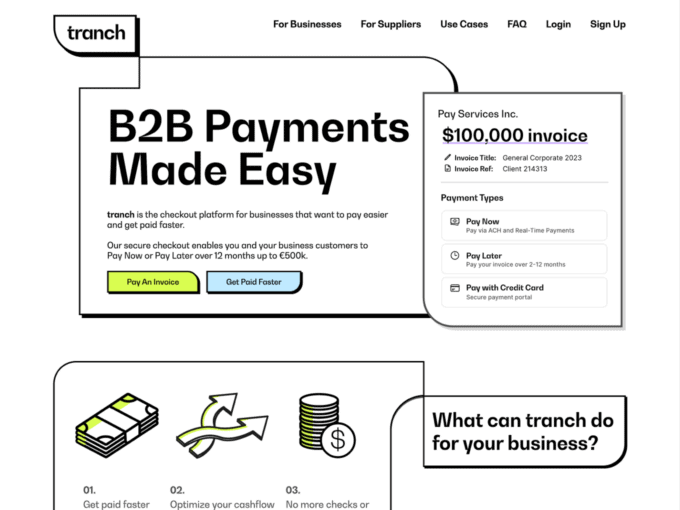
Tranch mostly uses a black-and-white colour palette but includes splashes of colour here and there.
What stands out about the aesthetics of this page is the comic-like outlining that is present throughout the page. This is a continued pattern that can be seen in different elements of the page and is inspired by the original logo of the company.
You can see the smart use of graphics and testimonials to enhance the features of the company and to bring life to the page.
10. LiveChat
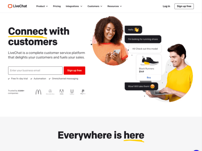
LiveChat’s landing page will immediately catch your interest. This has to do with the use of primary colours alongside white that are pleasing to the eye.
All the right places, including the signup area and the moving graphics, have been highlighted with colours. These graphics are the unique aspect of the page because they have been created and customized to the page and the company with moving elements.
Towards the end of the page, a section has been dedicated to customer reviews and one to customer support, where you can chat with the company.
11. Pinpoint
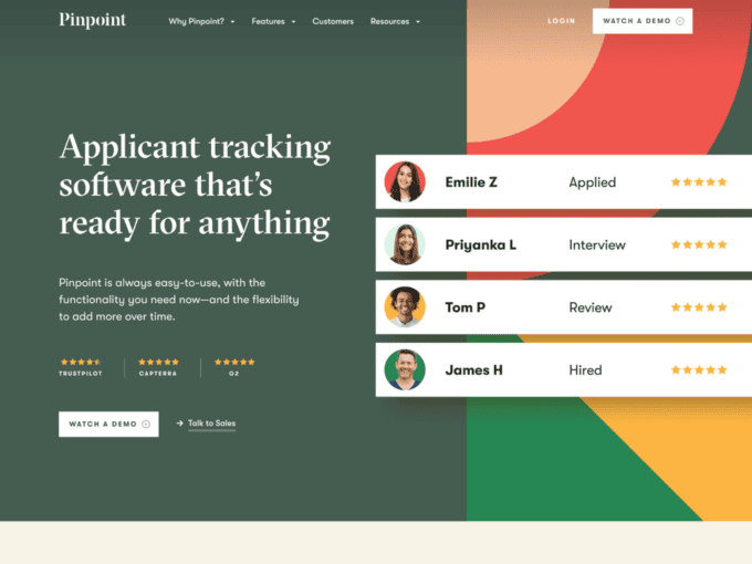
Pinpoint uses rustic tones in its landing page, and the same colour palette is used throughout.
On this landing page, the customer reviews are posted at the very top of the page instead of the very bottom. This is followed by features of the company and these are showcased thanks to graphics as well as clickable widgets.
Scrolling towards the end of the page, a section has been dedicated to the awards given to Pinpoint.
12. Chargetrip
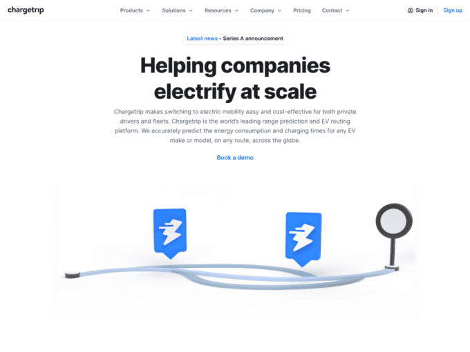
Chargtrip’s Product landing page starts with its key deliverable highlighted in bold. The page looks ordinary at first until the user starts scrolling.
As you scroll down the page, animations are found, making the layout extremely interactive. The use of minimal colours adds attention to the clever animations.
The page generates animations as you hover over the options included.
13. Testlio
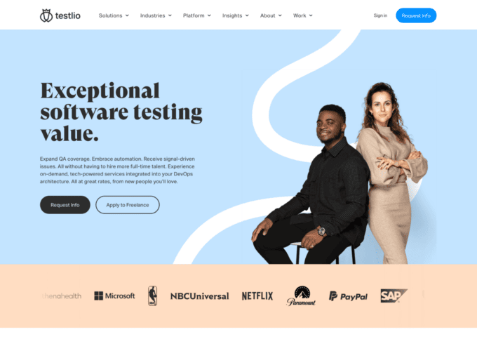
Testlio’s page also uses minimal colours for a particular reason. The minimalist white and blue bring attention to the graphics and photos included in the landing page, making them stand out vividly.
As you scroll down the product landing page, you find the various product deliverables that are all combined with a call to action widget.
Most of these product features are accompanied by highly vivid graphics that leap out from the page’s layout.
14. Aircall
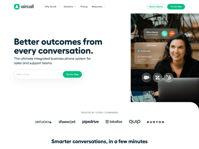
Aircall’s landing page opens with a try-for-free option. As the user scrolls down the page, the company lists its impressive list of customers, which includes names like Burton and Quip.
The product deliverables are displayed in interactive widgets. Impressive use of graphics allows users to engage and click with different features of the products.
At the bottom of the page, there is a list of frequently asked questions, that blends in beautifully with the page’s aesthetics.
15. Join
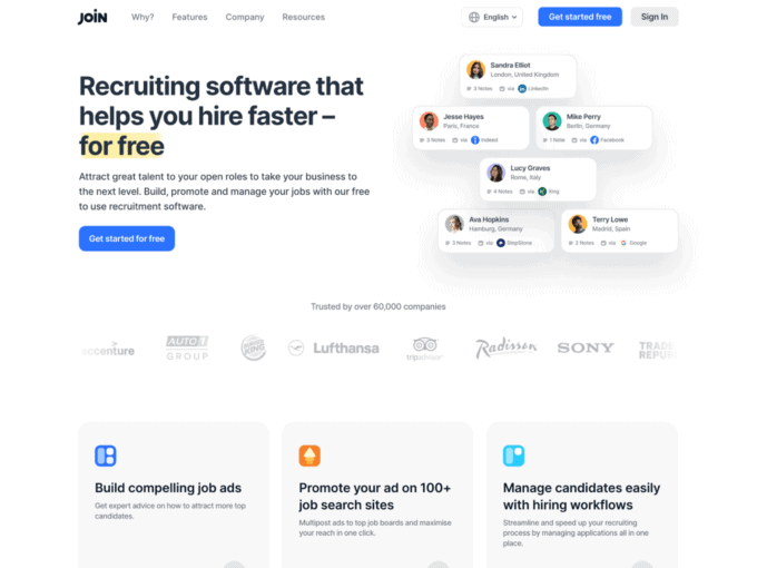
Join uses the start of its product landing page to highlight its’ key service, which is recruiting software. Highlighted in big black bold words, the main feature is displayed at the beginning of the page.
The use of colours here is also very limited, as attention has to be drawn to the product feature widgets. The interactive layout allows maximum user engagement.
Some use of bright primary colours brings life to the page and adds a bit of a welcome surprise.
16. Clearbit
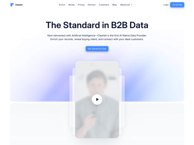
Clearbit is the first AI Native Data Provider. The page opens up with an advert that allows the users to find out the identity of who is visiting their website. A get started for free widget is displayed at the very top of the page.
As you go down the page, Clearbit incorporates its most famous customers in the background of the page’s layout as testimonials. The names include Asana, Hubspot, Intercom, and many more.
The page also includes the use of Artificial Intelligence that engages with the user as they go down the page, asking prompting questions, and providing support.
17. Ionic
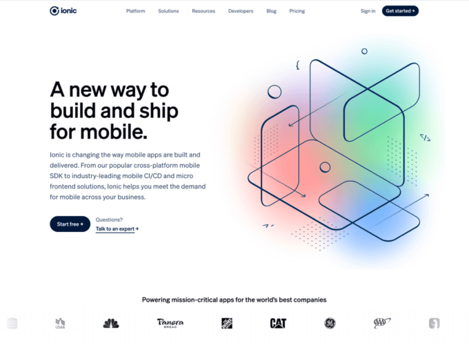
Ionic uses a muted palette of black and white in its beautiful landing page that is only broken with a splash of blue in the middle of the page.
The clever use of interactive graphics allows the company to display its testimonial customers. In the middle of the page, a section leading to other parts of the website like blogs and new announcements allows users to engage with other features of the product.
Near the end, Ionic uses success stories that are highlighted in bright and vivid colours, calling the user’s attention.
18. Overpass
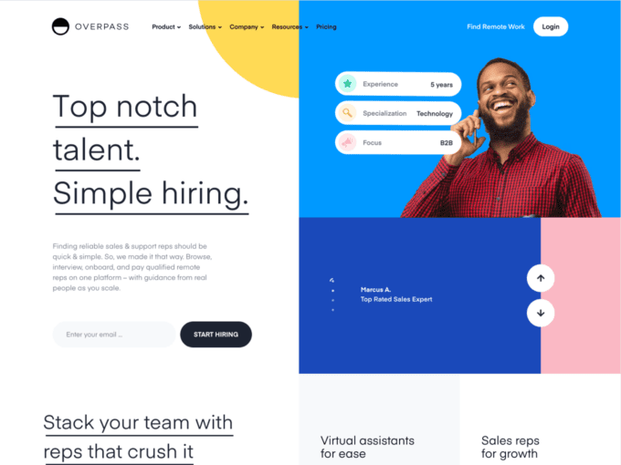
Overpass goes above and beyond to impress its users when they click on the product landing page. The page is initially blank until a range of interactive graphics rolls in to cover the page.
Scrolling down, Overpass uses the same technique. The longer the user stays in one place, the more information keeps appearing.
Beautiful ranges of colour are used on a white and blank canvas of the page, which highlights and brings attention to the product features.
19. Spendflo
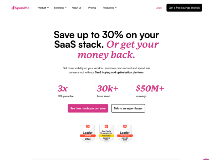
Spendflo’s landing page is a refreshing turn from the widely used colour palettes of SaaS websites. It uses a bright purple shade to highlight product features and also uses the same colour in the text.
The software allows you to get more visibility on your vendors, automate procurement, and spend less on every tool according to the website. These key deliverables are listed in more detail as users scroll down the page.
Near the end of the page, a clever widget is installed to allow users to estimate how much they can save if they switch to Spendflo.
20. Sleeknote
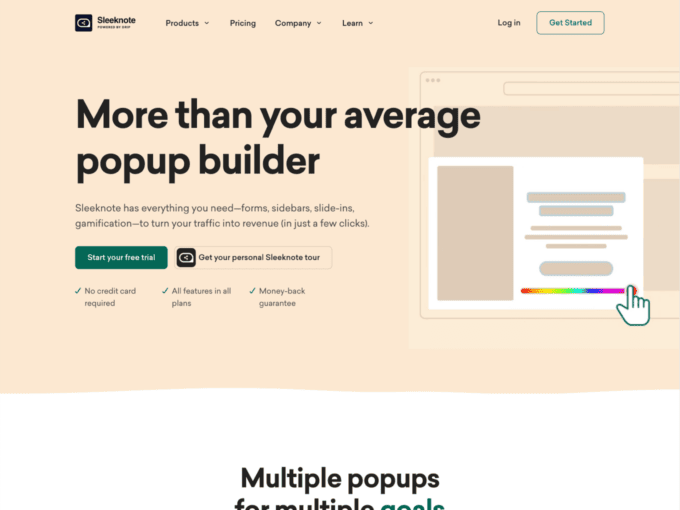
The landing page uses a slide-in feature for graphics on a blank canvas. Muted pastel pink tones are used for the background. The pastel changes colour from pink to blue to green as the user scrolls down the product page.
Product benefits are highlighted using stick-design cartoon graphics that add to the complexity of the layout.
At the bottom of the page, users are presented with a free trial or the option of browsing through more examples to satisfy personal curiosity.
21. Conductor
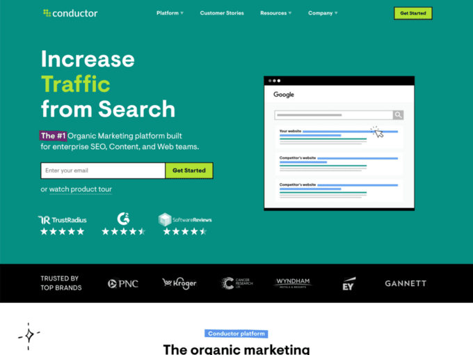
Conductor’s website landing page uses interactive elements to engage the user as soon as the page opens. The green of the page’s layout makes it stand apart from other websites with more minimalist palettes.
While many websites have chosen to have simple and plain landing pages, Conductor has other ideas. The product page is busy and full of interactive graphics.
The end of the page allows users to explore more of Conductor’s mission and open job roles.
22. Meter
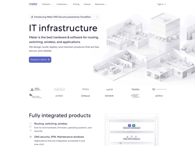
Meter is an IT infrastructure offering software. Staying true to the spirit of its SaaS offering, three-dimensional graphics are used in the page’s layout.
Moving down the page, product features are highlighted with the use of a blue background and graphics of a meter and its connections.
The bottom of the page allows users to plug in their requirements to see what will be the best fit for their business.
23. Kitchen.co
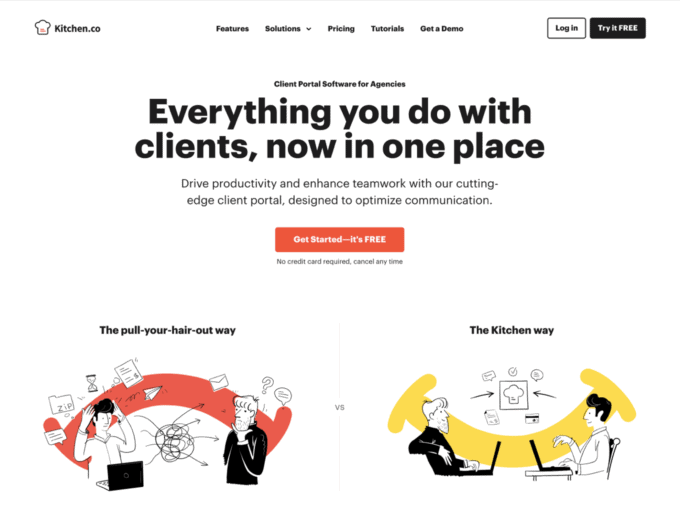
Kitchen co offers communication optimization services to other businesses. Their page opens up with this very key feature highlighted in black and bold.
As you go down the page, product features are accompanied by pictures and interactive elements.
At the bottom of the page, the users can see testimonials from other users.
24. Auth0
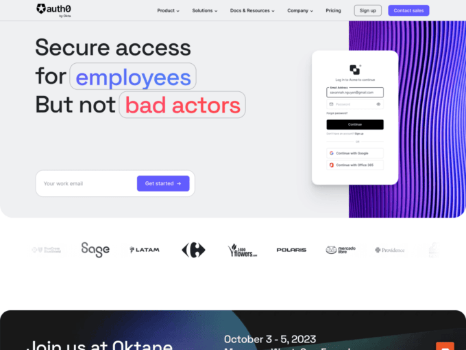
AuthO is a privacy and security software. Keeping in mind the tone of the service, a sombre black and gray palette gives gravity to the features of the product.
The page’s layout is interactive, with graphics rolling in to fill the page as the user keeps scrolling down.
The end of the page features ‘resources’ that offer users a chance to discover more about the service.
25. Smile.io
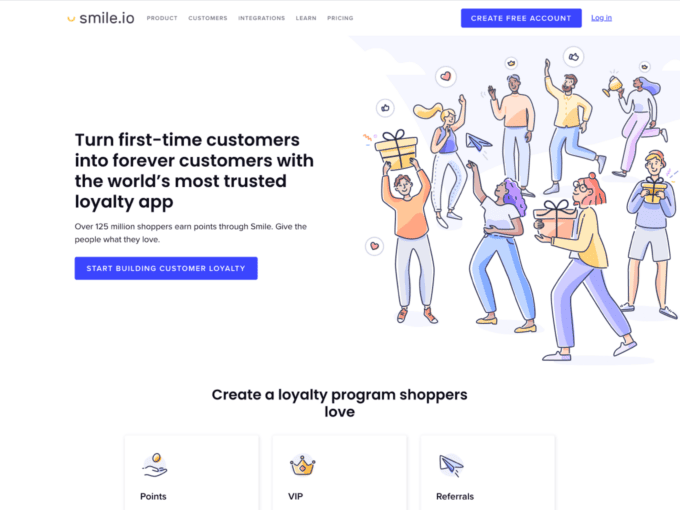
Smile.io offers business to cultivate customer loyalty as a service. This allows their product landing page to use colourful cartoon graphics to denote happy and satisfied customers.
The page is short and to the point, allowing maximum user engagement with all the product features outlined initially on the page.
Conclusion
Our collection of 25 product landing pages emphasises the importance of quality design and impactful messaging to drive conversions and engagement. Each of the landing pages we reviewed is a testimony to the art of combining aesthetics with functionality. Crafting a powerful product landing page requires balance between content and design, and the examples above serve as sources of inspiration.
A product SaaS landing page is more than just a digital door – it’s an entrance to create trust, credibility, and ultimately drive results. Every element you add to your landing page plays a role in influencing the visitor’s decision-making process.
If you want to learn more about product landing pages, we suggest you check out our collections of beautiful B2B landing pages, marketing landing pages, or the best SaaS landing pages.