20 Best SaaS Websites to Take Inspiration From in 2023
There’s no denying that the SaaS ecosystem has experienced tremendous growth in recent years. New companies are joining the market every day, and technological trends are reshaping our work.
Just to give you an idea, in 2023 (the year we’re writing this article), there are approximately 30,000 SaaS companies worldwide. And by 2024, that number is expected to reach 72,000 SaaS products, with an annual growth rate of nearly 60%. It’s pretty impressive, isn’t it?
As competition continues to grow (or double, to be precise) and markets become harder to conquer, what do you think is one of the key differentiation factors the best SaaS companies are pursuing? Well, it’s undoubtedly their focus on design. These companies are deeply invested in researching the best practices for usability and accessibility, ensuring high-quality interfaces for their apps, landing pages, and, of naturally, websites.
So, in this list, we’ll present what we believe to be the top 20 SaaS websites of 2023, meticulously hand-picked from our gallery of the best SaaS landing pages.
Before we dive into the examples, let’s take a step back and discuss some important points that are crucial to understanding the structure of a SaaS website, so that we all have a frame of reference for evaluating the quality of the sites included in this list.
What’s the difference between a SaaS website and a website?
For a SaaS website, we refer to a specific website designed and developed for a Software as a Service product. Its main goal is to turn potential customers into free trial users or paying customers.
Naturally, a SaaS website can have different goals depending on the project’s maturity. For example, initially, it may focus on collecting email addresses in preparation for an upcoming launch. However, the ultimate goal is to convert prospects into paying customers.
As for a regular website, it’s a much broader and more generic word, containing a variety of markets and business models.
What’s the difference between a SaaS website and a landing page?
A SaaS website is a container of content that includes various pages, such as the homepage, pricing page, etc. On the other hand, a SaaS landing page, as the name implies, is a single page designed to guide the user to take a specific action.
In simpler terms:
- SaaS website: A container of many pages.
- SaaS landing page: A single page designed to guide the user to take an action
What are the key elements of a successful SaaS website?
Based on our experience analysing the best SaaS landing pages, we can confidently say that there are 5 key elements that make a SaaS website successful. Let’s take a look at them together:
- Homepage: Also known as the landing page, this is by far the most important page of any SaaS website. It includes a summary of the critical elements of a website, and generally, it is divided into three parts: Above the fold, the body, and a bottom call to action.
- Pricing page: Immediately after the homepage, the pricing page is undoubtedly the second most important page of a SaaS website as it contains the economic information of your offer, and in many cases, it’s where the conversion takes place. It typically includes pricing tabs, a breakdown of features, a FAQ list, testimonials, and a bottom call to action.
- About Us page: Although we cannot consider this page mandatory for a SaaS website, it delivers incredible value to prospects as it creates empathy and generates trust. It can contain various elements, but it’s almost essential to include an overview of the team and the product’s story.
- Documentation: The documentation serves as the product’s ID and becomes crucial if the product is highly technical and requires a learning curve to be used. Documentation may not be necessary for all SaaS websites, but it is a conversion machine for specific types of SaaS.
- Contact forms: For enterprise and corporate products, a well-designed contact form can help prospects get in touch if they have questions or concerns about the product, as well as schedule a demo if they are interested in trying the app.
What criteria did you use to determine the best 20 SaaS websites?
We created this list using all of our experience, and we’ve established as many objective standards as possible in order to decide which websites were the best. These criteria range from quality of the design, layout/content structure, copy and clarity of the message, and overall value proposition. We are aware that other criteria could be included in the list but, since we had to choose, we decided to emphasise these more than others.
How can I create a beautiful and high-converting SaaS website?
There is no simple answer to this question because it varies depending on several factors. For example:
- If you’re a designer, you could partner with a professional front-end developer or use a powerful website builder tool like Webflow or Framer.
- If you’re a developer, you could find a talented designer or use a ready-made SaaS website template, like the ones available on Cruip.com.
- If you’re a non-technical person, you could use a high-quality unlimited design service or hire a contractor via a trustworthy network like Toptal.
Whatever your skills, today there are many ways to develop a high-quality SaaS website with relatively low costs.
The 20 Best SaaS Websites in 2023
1. Linear
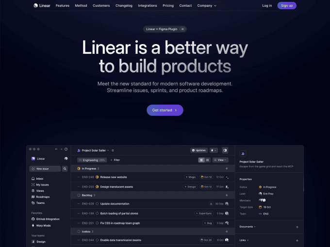
Linear is a productivity app that lets teams manage software development and track bugs. The app is very famous for adopting insanely high-standard in UI/UX design, and for showcasing one of the most beautiful SaaS websites in the tech space.
Things we appreciate about this website:
- Overall design quality: The design of Linear has set a trend in the world of web design. Many startups have been inspired by them for the layout of their websites, and this trend is still alive and destined to last over time.
- Attention to detail: Every element on Linear’s website is meticulously crafted. From the illustrations to the animations, nothing has been left to chance.
- Rich content: Linear’s site includes several inner pages, and each one of them has been structured to describe the product’s story and create value for the customer.
2. Glide
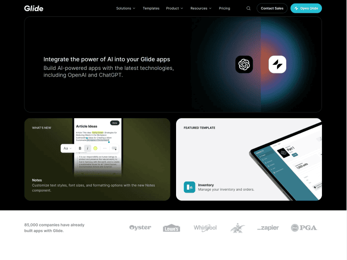
Glide is a browser-based web application that allows individuals, teams, and agencies to create native and hybrid mobile apps using spreadsheets. Glide is probably the most popular company serving this specific niche/space, and part of its success is also due to its aesthetic.
Things we appreciate about this website:
- Overall look and feel: The look and feel of Glide blend modern and corporate elements, giving the product a strong character. It wasn’t easy to combine these two souls, but they have succeeded greatly, and the final result speaks for itself.
- Use of images and animations: With visual builders, it’s crucial to show users how a product appears. The Glide team has excelled in this aspect, transmitting to the users the desire to try out the product.
- Layout structure: With many pages and a rich volume of content, it can be challenging to maintain simple and clean website navigation. But this isn’t the case since everything is structured nicely.
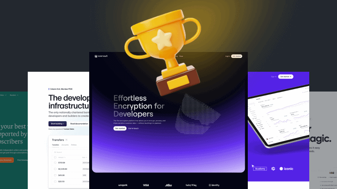
3. Evervault
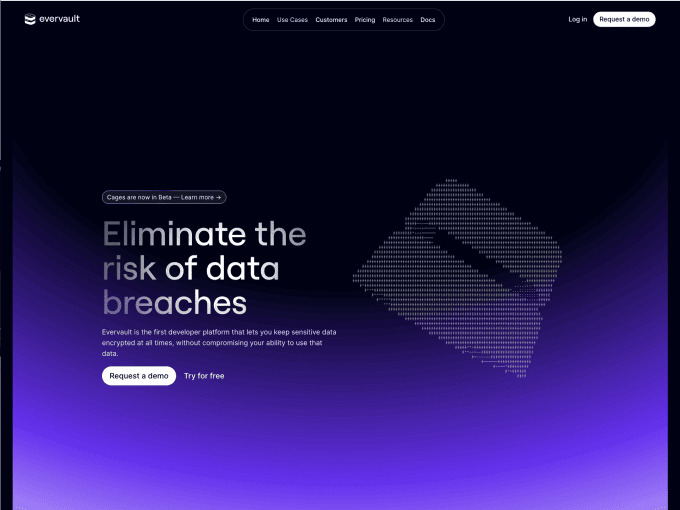
Evervault is a flexible data security and encryption platform that helps developers protect sensitive customer data. Like Linear, the website of this product has set a new trend in modern web design, with many companies emulating it.
Things we appreciate about this website:
- Design uniqueness: When a product has a bold identity and strives to showcase it through its design, the results are always breathtaking. Evervault has achieved this, and its aesthetic is setting trends in web design.
- Product animations: Describing intricate concepts like encryption is always challenging, but when you have a talented designers/developers team, anything is possible. The animations on this site are fantastic and explain long paragraphs of text in just a few seconds.
- Inner-page quality: From the moment you land on this site, it’s obvious that nothing has been left to chance. The quality of graphics, animations, and messaging is present throughout.
4. Sketch
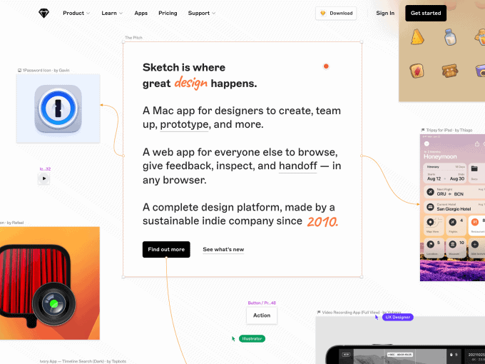
Sketch is a design tool that allows designers, developers, and product people to easily create user interfaces, prototypes, and vector graphics. It’s no surprise that a product that has made its way to the top as a design tool would excel in website aesthetics; it’s been dictating design trends for years.
Things we appreciate about this website:
- Design consistency: In our opinion, Sketch has one of the most creative design teams in the world, and the quality with which they create and maintain consistency in this industry undoubtedly makes them pioneers of innovation.
- Attractive graphics: From the icons to the illustrations and product screenshots, the harmony of the drawings blends into a single mood, making the design smooth and enjoyable to navigate.
- Smart effects and animations: Let’s talk about the drag-and-drop effect of all the elements on this homepage. What can we say other than it’s mind-blowing?
5. Dovetail
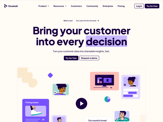
Dovetail helps teams of all sizes uncover insights across all kinds of customer touch-points, including user interviews, product feedback, and competitor analysis. This software has a long history of excellent SaaS design–there was no chance we would not include it on this list.
Things we appreciate about this website:
- Product sneak peeks: Every page on this website includes screenshots of the application. We love this communication strategy as it helps users remember the messages and instantly clarifies potential doubts.
- Friendly design style: From the illustrations, to the colours and images, everything in this design looks friendly and conveys a strong sense of empathy with the company.
- Strong visual presence: All the contrasts on this site are meant to be noticed because they highlight that Dovetail is not just any product but the best in its class.
6. Attio
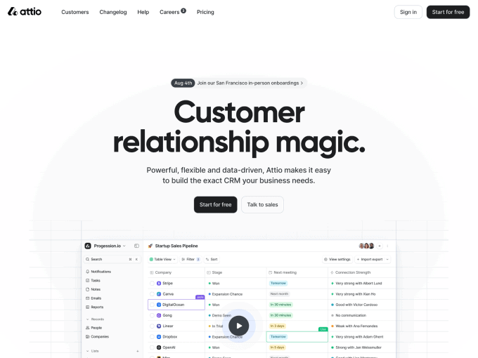
Attio is a data-driven platform that enables teams to build their exact CRM. It offers all the tools a startup needs to create real-time global databases. In spite of being a young company, Attio’s SaaS website presents a mature structure and all contents have been nailed down from the foundation.
Things we appreciate about this website:
- Clean layout: We truly dig the simplicity of Attio’s layout which merges the beauty of extensive white spacing and simple fonts with straightforward screenshots surrounding every corner of the page.
- In-app views: From the homepage to the last piece of content, there is no place on this website where a message isn’t accompanied by a screenshot of the app. Each illustration is custom-made and displays real-life data.
- Simple palette: The use of a monochromatic grey palette, with blue as the accent colour, simplifies the design and encourages users to focus on the content.
7. Qonto
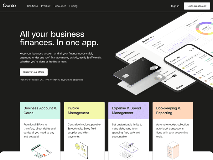
Qonto is a FinTech company that helps freelancers and small businesses manage their payments, finance, bookkeeping, and anything related to their businesses. The app has always shown interest in quality design, and its SaaS website keeps improving and evolving yearly.
Things we appreciate about this website:
- Visual balance: Although Qonto is a bank (or something very similar), the design team has been mindful not to appear too corporate in its look and feel. Instead, it has opted for a ‘youthful’ style that appeals to the new generation of entrepreneurs.
- Adaptable content: Some messages or concepts on this website can be complex to digest. However, Qonto has done an excellent job simplifying them through captivating graphics and interesting visuals.
- Excellent usability: When a team prioritises usability, it’s noticeable, and Qonto is a good example of this. While there might be some room for improving accessibility, the website’s navigation is smooth and seamless.
8. Notion
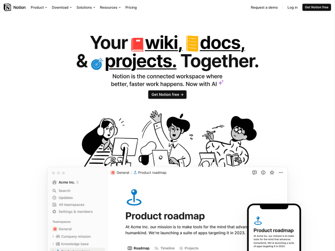
Notion is a powerful workspace and CMS that lets individuals and startups manage notes, tasks, projects, and more. It has always been at the top of the game when it comes to great web design, inspiring creatives all over the world with its playful and clean aesthetic.
Things we appreciate about this website:
- Strong brand identity: Notion is one of the most iconic companies in the tech scene, and its influence is well-visible across its entire website. The illustrations on its home page have inspired several startups over time.
- Layout cleanness: The Notion website has a clean, streamlined design that makes the most of white space, and the site’s almost entirely greyscale colour scheme gives it a sleek look.
- Accessible interface: The accessibility on the Notion website is just as robust and appealing as its brand identity. Every single page is a pleasure to browse and navigate.
9. Lemon Squeezy
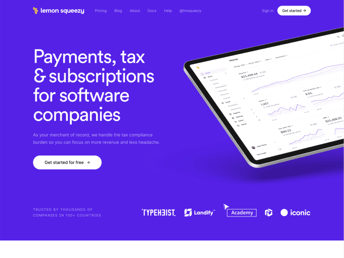
Lemon Squeezy offers payments, subscriptions, tax compliance and email marketing to help businesses and freelancers succeed online. The product is relatively new to the market but has gained popularity thanks to its design.
Things we appreciate about this website:
- Fresh structure: Through its modern layout structure, and the organisation of every single component, Lemon Squeezy has developed a SaaS website that speaks for itself in the space of payments online.
- Content hierarchy: The content is elegantly laid out across the different website pages, and the page hierarchy is well-defined, highlighting what’s important first.
- Concise messaging: The website’s overall message is clear and concise, and even the pricing (a tricky subject for payment providers) is easy to understand.
10. Mailchimp
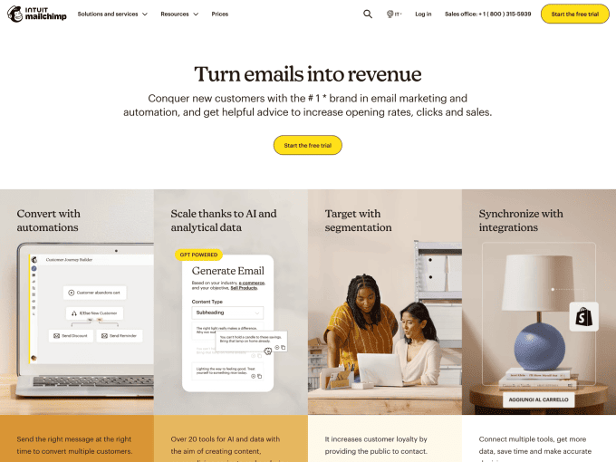
Mailchimp is an email marketing and automation platform that helps businesses market their products and services through email, websites, and social media. It has been around for years and always paid great attention to its design.
Things we appreciate about this website:
- Original aesthetics: Even though the palette and images might seem outdated to modernists, we like the website’s overall look because it reflects the maturity of the product and brand.
- Breakdown of features: Mailchimp does a great job advertising multiple products on its website, using top navigation and body tabs.
- Clear plans: It can be hard to show multiple plans when a company supports multiple sub-products, but that’s not the case with this website since everything is easy to understand.
11. Nova Benefits
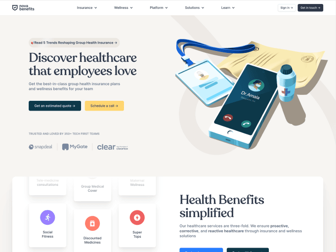
Nova Benefits is an employee wellness platform designed to help Indian companies find the best deals for their employees at the best possible rates. This company pays great attention to design, and its SaaS website it’s the result of such care.
Things we appreciate about this website:
- Overall UI: There is no doubt that this website has been developed by professionals who pay great attention to detail and everything that matters in web design.
- Pastel design: The choice of a palette ranging from pastel to more vibrant tones creates interesting contrasts that make the website lively.
- Quality graphics: All the graphics on this website are excellent and stand out for being perfectly integrated with the content.
12. Harvest
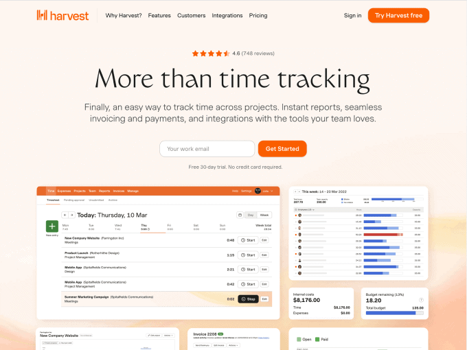
Harvest is a time-tracking and management software that helps freelancers keep track of their time, capture critical data and better estimate future assignments. The company’s new website design gives Harvest a renewed look and identity.
Things we appreciate about this website:
- Authentic identity: We believe that Harvest’s rebranding is one of the most successful among those listed in this roundup, and we are even more convinced because it’s not just us saying it.
- Content clarity: All the website’s content is well-structured and alternated to make navigation easy for users.
- Brand authority: Just a few seconds of browsing the Harvest website reveals the brand’s authority in the time-tracking industry and the appreciation from its customers for the product.
13. Spline
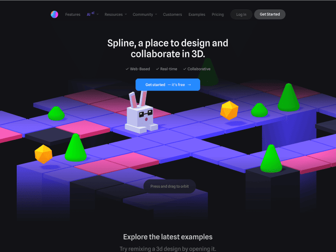
Spline is a graphic design tool that lets designers build, share, and publish 3D illustrations. It’s much simpler to use than traditional 3D tools, and everything related to its aesthetic–from the website to the app–is top-notch.
Things we appreciate about this website:
- Dark layout: This is not the only dark SaaS website we have included in this list, but it is undoubtedly our favourite for the quality of execution and level of contrast.
- Dynamic imagery: Displaying what is possible to create with Spline adds great value to the product and encourages users to try the app.
- Tutorials & examples: If a potential customer is not persuaded by the quality of this product, they can take a quick look at the tutorials section to see what it can do.
14. Column
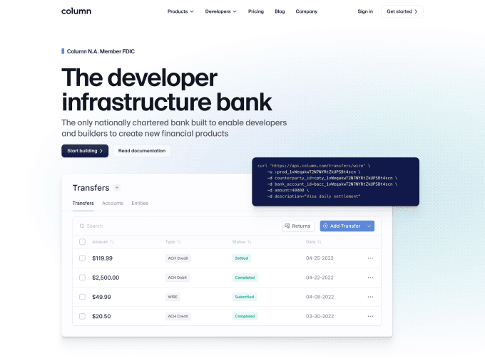
Column is a bank infrastructure company that enables developers to set up financial products and services for their applications. Column’s website is clean and refreshing to browse, and the overall look and feel reminds us of Stripe.
Things we appreciate about this website:
- Layouts & sections: The layouts and sections of this website have been designed creatively, giving prominence to the most important content and including plenty of white space wherever necessary.
- Illustrations quality: The alternating of product screenshots and animated 3D illustrations add visual interest to the website and showcase the attention to detail this company dedicates to design.
- Variety of pages: Every page on this website is content-rich and designed with the same meticulousness and professionalism.
15. Ahrefs
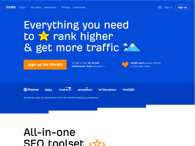
Ahrefs is a leading SEO company that builds tools, resources, and marketing materials for SEO specialists and agencies. The recently renewed website stands out for originality, and the overall mood (palette, graphics, etc.) has a strong personality.
Things we appreciate about this website:
- Friendly tone: The palette, graphics and messaging have been designed to create a friendly atmosphere and foster empathy with the visitors.
- Clear benefits: Throughout all the pages of Ahrefs’ website, the benefits are presented clearly, encouraging users to take action.
- Fancy testimonials: While testimonials are not mandatory for a SaaS website when you can create something like this case, customer testimonials can add significant value to your brand.
16. Substack
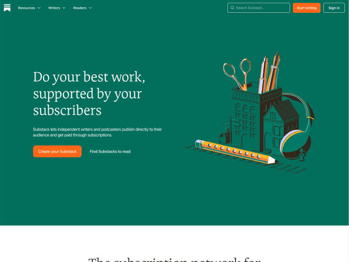
Substack is a community platform that helps creators quickly set up a newsletter, grow an audience, and make money online. The company has recently redesigned its website giving a refreshed identity to all its users.
Things we appreciate about this website:
- Creators list: Substack is a product that helps creators build a following, and it’s very coherent that the website gives them significant visibility.
- Fancy images: The images on this website are carefully crafted and complement the content without distractions.
- Content discoverability: It’s interesting that the Substack website not only promotes its services to new users, but also provides a space for newsletter creators to showcase their work.
17. Going
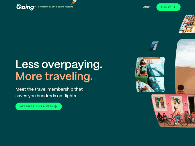
Going is a subscription-based website that helps travellers find great deals on trips departing from any US airport. The new website, which has just been revamped, is bright, cheerful and fun–it makes users feel as if they are already on holiday.
Things we appreciate about this website:
- Attractive pictures: The Going website makes you feel like you’re already on vacation, and a big part of this is thanks to the beautiful photographs that capture landscapes from around the world.
- Animated illustrations: Not only do we love the style of the graphics on this website, but the fact that they are animated adds an extra touch of magic.
- Colour palette: We don’t usually praise a ‘simple’ colour palette, but in this case, we want to do it because it truly deserves recognition.
18. Figma
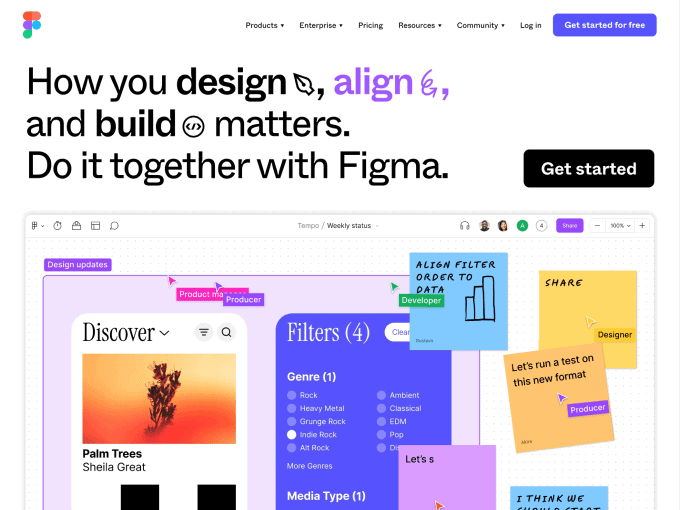
Figma is a web and desktop web application for interface design. The tool allows individuals and teams to create UIs and prototypes collaboratively. The recently updated website displays great character and big attention to detail.
Things we appreciate about this website:
- Product frames: Continually showcasing product frames on a website seduces visitors to try the product, as is the case with this website.
- Videos quality: The importance of high-quality videos on a SaaS website is often underestimated, but not at Figma. They have several beautiful videos that effectively showcase their product.
- Bold messaging: Figma confidently asserts itself as the world’s number one tool for creating user interfaces and prototypes, and it manages to convince others of this because its messaging is bold and direct.
19. Ghost
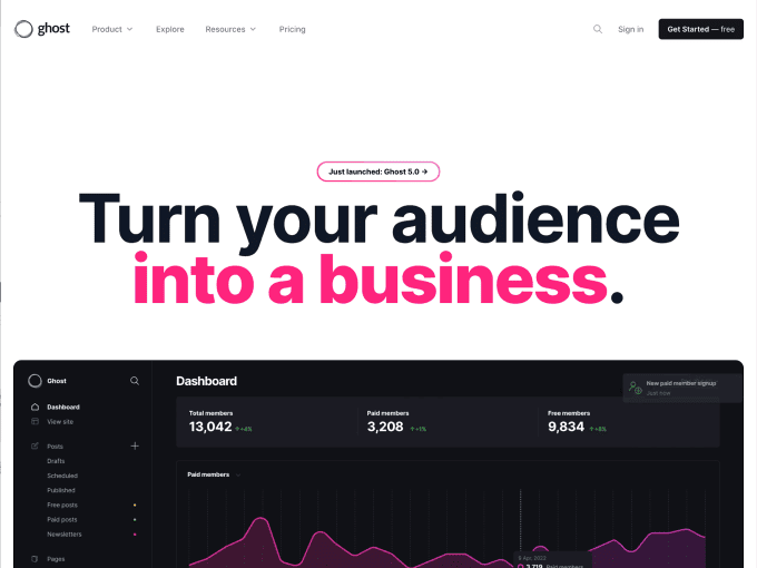
Ghost is a blogging platform that allows creators to easily build a website, publish content, send newsletters and get paid via one-off payments or subscriptions. The website is modern and on point with several points of interest to choose from.
Things we appreciate about this website:
- Content richness: The Ghost website doesn’t hold back on details and offers dozens of sections and pages that thoroughly explain the value of their product.
- Product previews: Throughout the website, users encounter various previews of the product that, as mentioned previously in this article, brings great value.
- Quality testimonials: Testimonials are a powerful asset for converting new users and we are sure that Ghost knows it well.
20. Wise
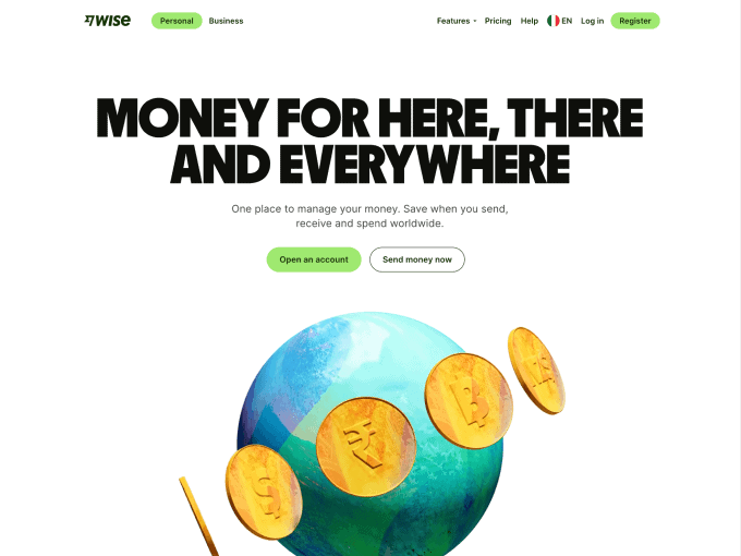
Wise is a modern banking platform that enables individuals and companies to hold, spend, and receive money in over 50 currencies at the best exchange rates. The company recently underwent a massive rebranding bringing its identity to a new level.
Things we appreciate about this website:
- Strong brand identity: There is no doubt that a rebrand can bring a new light on a company, and in the case of Wise, it even reinforces the authority they already held in the banking sector.
- Smart copy: All the messages on this website speak to a new generation of young customers, creating a more relatable and engaging experience.
- Simple usability: On Wise, you can literally send money to another part of the planet in seconds. The ease of use plays a significant role in making similar experiences possible.
Conclusions
We’re confident that this article and the information in this list will be useful to you in creating or improving your SaaS website. Of course, we don’t claim to have included all the best examples here, but we think these 20 will be helpful in inspiring and enhancing your work.
If you’re looking for resources to improve your SaaS website, have a look at this list of the best tools for creating SaaS landing pages and websites. And if you want to immerse yourself in further inspiration, feel free to explore our website gallery.