15 Outstanding Integration Page Examples
Integration pages are becoming increasingly popular nowadays as more and more apps connect to each other to enhance their performance and tap into new potential markets. Additionally, integrating third-party services is an excellent SaaS marketing strategy, as it expands the audience of possible customers who can use a specific product or service.
What is an integration page, and how does it work?
An integration page is a space that features all the products and services that integrate into a particular app. You can think of it as a list of third-party applications that users can connect to a specific service.
In terms of content, this page features a categorized list of compatible apps, along with details on how each app works.
Integration page best practices
Regarding the best practices, here are a few simple advices to help you create an effective integration page:
- List all available integrations in clearly defined categories with a search function to streamline research.
- Add details about each app that integrates with your service: what it is about, how it works, and the benefits.
- Add a clear and visible CTA button to each application to make the integration process easier.
15 Outstanding Integration Page Examples
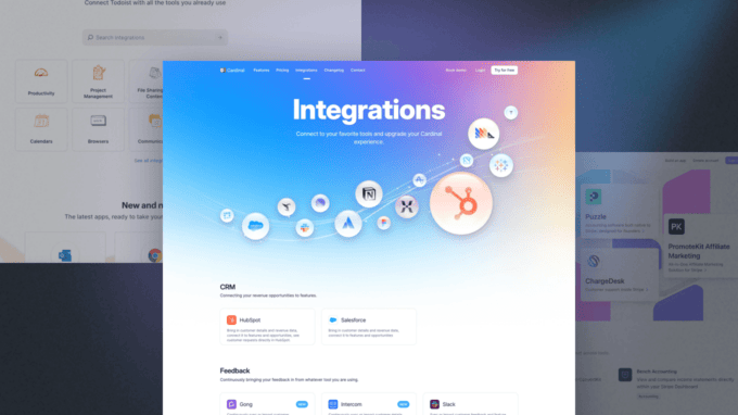
1. Cardinal
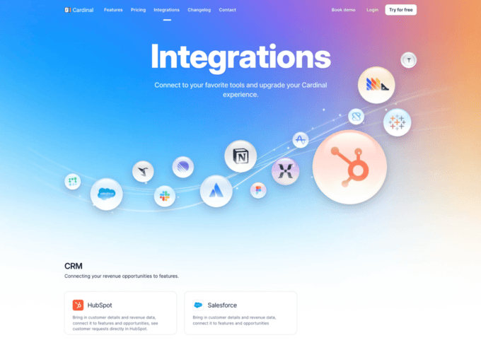
The Cardinal integration page features an attractive hero section that showcases a visual representation of all the third-party applications that can be connected into the service. As users scroll down, they will find a categorized list of all available integrations and a CTA at the bottom of the page to encourage them to try the product.
Things we like on this page:
- The top visual gives this page character and immediately communicates what apps you can connect with the tool.
- Each integration is summarized in a thumbnail, saving the user time and clicks.
2. Retool
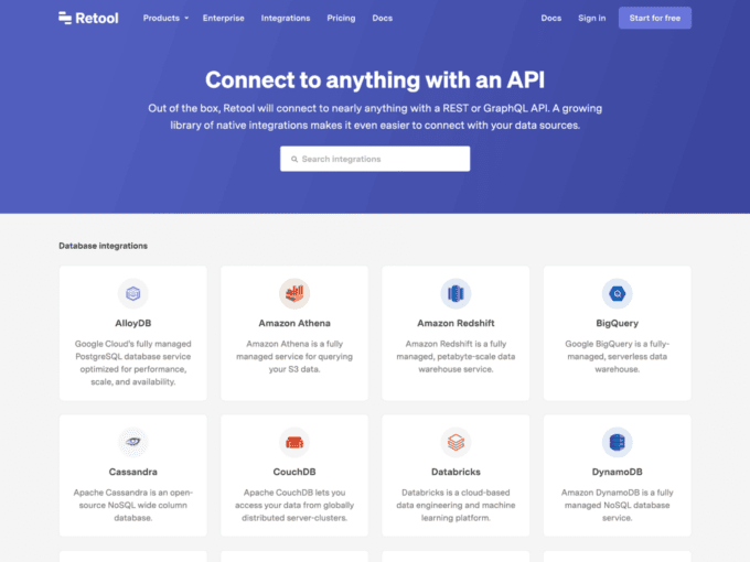
Retool provides a user-friendly interface for their partners, including a prominent hero with a search bar and a list of all available integrations. Each app thumbnail offers a brief overview of the service, and you can access a dedicated landing page by clicking on it.
Things we like on this page:
- The layout is straightforward to navigate, and the search box makes browsing the apps effortless.
- Creating a dedicated landing page for each integration showcases appreciation for partners and adds value to their offerings.
3. Todoist
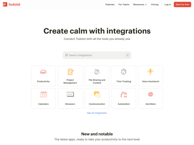
Todoist’s integration page includes a prominent search box above the fold and a list of categories that divides the apps into productivity buckets. As users scroll down, they can see a list of the most popular apps, and a directory of collections that cater to specific use cases and purposes.
Things we like on this page:
- Productivity buckets are a great way to simplify the research of available apps and make the user feel there is more to scroll.
- Showcasing collections to accomplish tasks is valuable for both individuals and teams.
4. Stripe
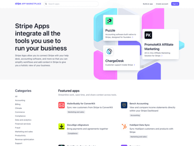
This interface by Stripe is an outstanding demonstration of how designers can effectively combine beauty and functionality. The upper section of the page features an excellent mixture of colours and app cards, and by scrolling down, users can access a collection of apps with all the dedicated pages.
Things we like on this page:
- Stripe elegantly combined apps and visuals demonstrating that different elements can coexist together
- The sidebar directory is an efficient solution to streamline the search process.
5. Cycle
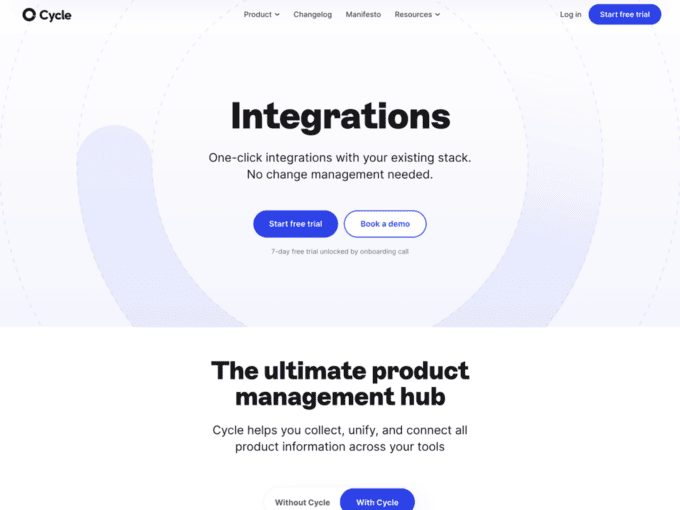
The Cycle integrations directory may not have a wide variety of apps, but it is structured in a way that makes the offering appear larger than it is. The layout is divided into three parts. At the top, there is a simple heading and two CTAs. In the middle, an excellent illustration demonstrates product management with and without Cycle. Below that, there is a directory of available apps.
Things we like on this page:
- The dynamic illustration in the middle of the page effectively communicates the product’s value proposition.
- The integration page is rich in details and contains multiple CTAs for easy connection.
6. Ramp
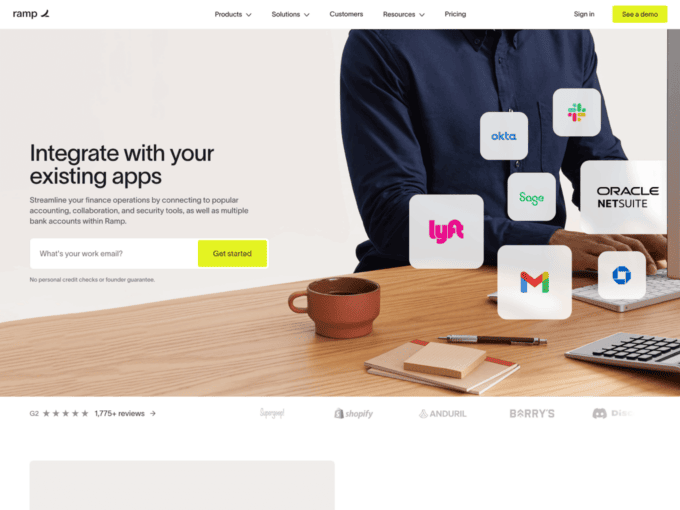
The integration page of Ramp streamlines finance operations by connecting to popular accounting, collaboration, and security tools. The design features an impressive hero section with a clear call-to-action. Below it, there is a comprehensive list of features and an app directory.
Things we like on this page:
- The zig-zag section is a great addition for learning more about partner opportunities.
- The CTAs throughout the page encourage users to sign up for the free trial.
7. Resend
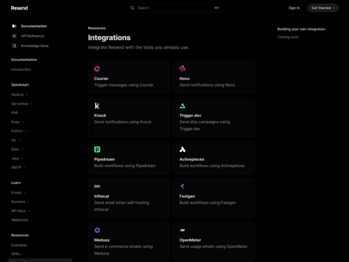
This page is simply an app directory showcasing all resources integrated with Resend. The list comprehends tools the standard user already uses in its workflow, with the opportunity to create custom integrations.
Things we like on this page:
- The directory is divided into three sections for better organization: Available apps, upcoming resources, and custom integrations.
- Each integration links to an external product documentation.
8. Mixpanel
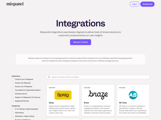
In the vibrant Mixpanel style, this page organizes content into two distinct blocks: On the left side, a multi-level menu displays app categories and collections. On the right side, there is a list of apps along with a search box at the top.
Things we like on this page:
- The interface layout is well-structured, providing clarity and ease of use.
- The integration list is extensive, and each option has its own standalone product page.
9. Onfolk
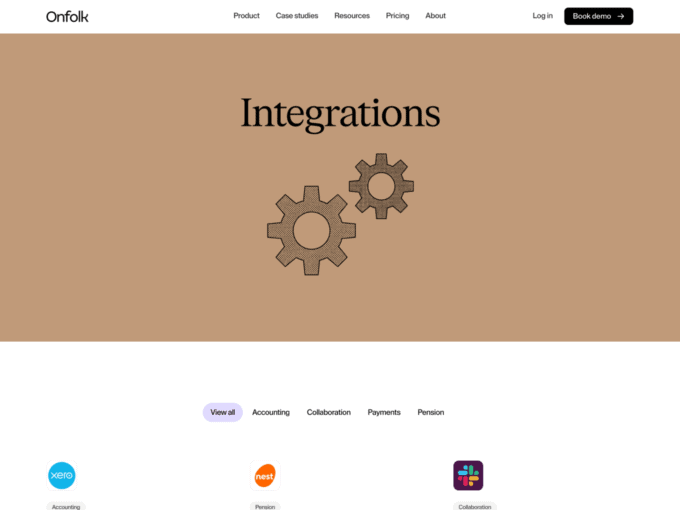
Onfolk is an excellent example of straightforward design. This page only includes a sortable top navigation and product integrations list. Clicking on any app in the list redirects the user to an external page that provides all relevant information.
Things we like on this page:
- The simplicity of the interface is a strategic approach to engaging visitors.
- The page offers the option to book a 25-minute product demo, which can be useful for first-time visitors.
10. Groove
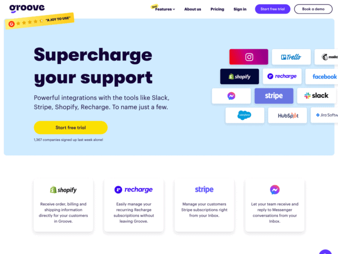
Groove is an alternative to Zendesk that claims to be simple and powerful. The company organizes its integration page into three sections. At the top, users can find a preview of the big brands that connect with the product. In the middle, there is the app directory. Finally, at the bottom of the page, customers can find testimonials, which are unusual for this type of content.
Things we like on this page:
- The design is dynamic, vibrant and compelling.
- The presence of customer testimonials brings trust to the overall brand.
11. Junip
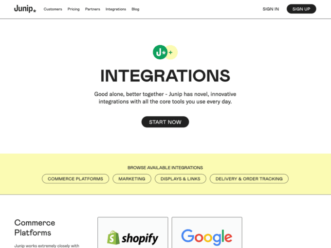
Junip offers a novel and innovative directory that includes integrations for commerce platforms, marketing, and order tracking. The page displays a list of apps divided into categories, and a bottom section to submit product improvements and ideas.
Things we like on this page:
- Each app has a dedicated interface, including the pros and cons of the choice.
- There are only a few names in the directory, but they are the best brands in the market.
12. Whelp
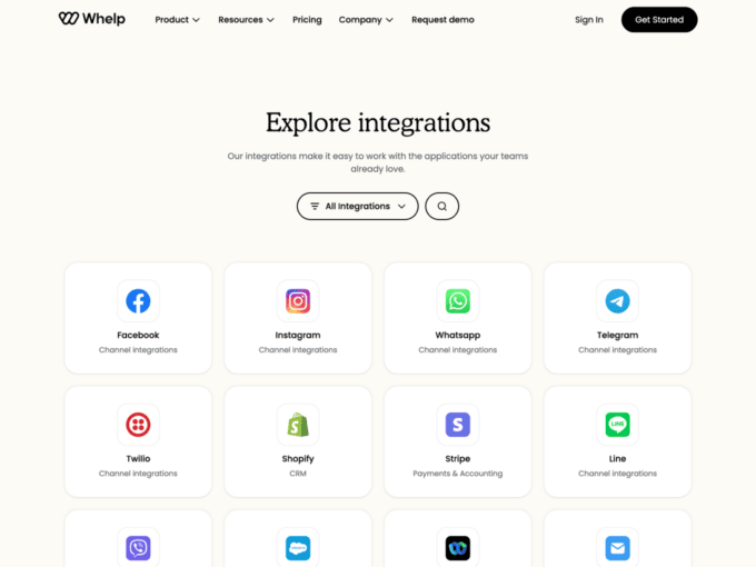
Whelp makes it easy for teams to work with the applications they already love and use. The layout is structured as a typical app directory with filters, search box, thumbnails, and a list of frequently asked questions.
Things we like on this page:
- The straightforward layout encourages users to try out all the apps that are available.
- The FAQ section provides clear explanations for visitors regarding the product’s functionality, technical requirements, and other common questions.
13. Primer
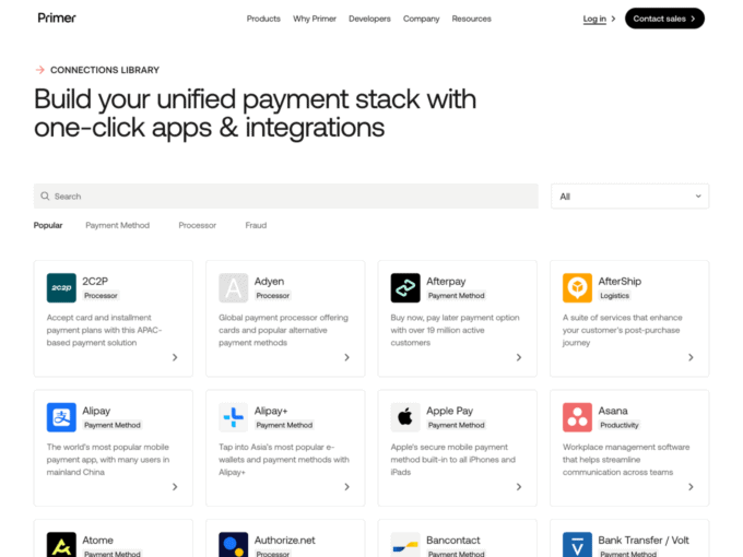
Primer helps developers build an unified payment stack with one-click apps and integrations. This page offers advanced search options and filters at the top, along with a vast collection of individual connections, each with its own dedicated page.
Things we like on this page:
- The top filters are bright, allowing users to find what they are looking for quickly.
- The dedicated page offers details, features, and market coverage for the specific connection.
14. PandaDoc
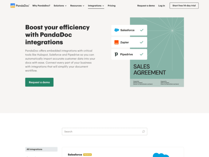
PandaDoc provides convenient integrations with Hubspot, Salesforce, and Pipedrive, allowing users to import and export customer data efficiently. The directory of apps is divided into two parts, and each integration has a detailed landing page with a video explanation.
Things we like on this page:
- The landing pages are thoughtfully curated and offer more than the average user might expect.
- Premium integrations can be an intelligent approach to increase conversions.
15. Stellar
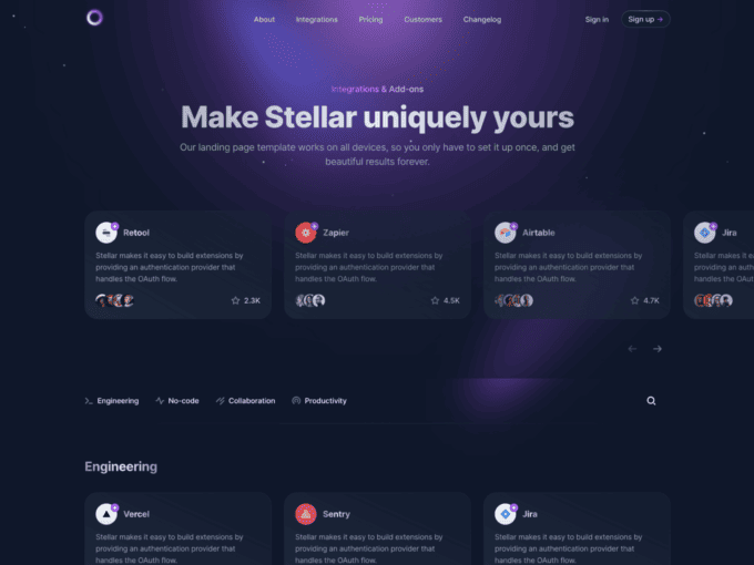
Unlike the other pages we reviewed so far, Stellar isn’t a product but a premium template from Cruip, a gallery of Tailwind templates. We thought it was worth including it on this list because it offers beautiful pre-made components, such as a top carousel, a clickable apps directory, and a dedicated layout for each integration.
Things we like on this page:
- The top tabs are unique and allow users to get to the category they are interested in quickly.
- This modern dark landing page template is versatile and can cater to the needs of a wide range of users.
Build The Perfect Integration Page
If you are a designer or a developer looking to create an integration page for your product or client, this list will provide you with all the inspiration you need to design the perfect layout for the users. If you’re interested in SaaS, we recommend you look at this gallery of the best SaaS landing pages. Our website offers more than just landing pages; we provide resources on the best how it works pages, changelog pages, comparison pages, help center pages, and much more. Check out our blog to read them all